


Name: Mark SubbaRao
Title: Lead, Scientific Visualization Studio (SVS)
Formal Job Classification: Information Technology Specialist
Organization: SVS, Science Mission Directorate (Code 606.4)
What do you do and what is most interesting about your role here at Goddard? How do you help support Goddard’s mission?
I have an amazing job. I get to work with all the most interesting NASA science and make it visual to help people can understand it. The Scientific Visualization Studio, the SVS, supports all of NASA and is located at Goddard.
What is your educational background?
I have B.S. in engineering physics, minor in astronomy, from Lehigh University in Bethlehem, Pennsylvania. I have a Ph.D. in astrophysics from Johns Hopkins University.
What is data visualization? How is it different from animation?
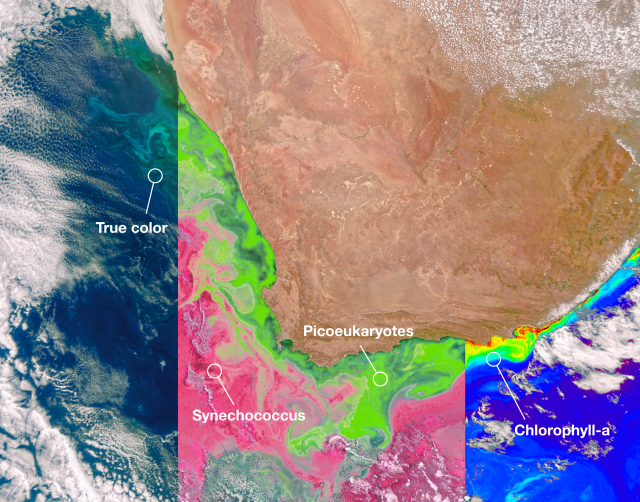
Data visualization is the graphical representation of actual data (in our case usually scientific data). At its most basic it takes the forms of charts, graphs, and maps. In contrast, conceptual animation, such as the work of our colleagues in the CI Lab, is the graphical representation of ideas. Conceptual animation and data visualization are both needed to communicate the full scientific process.
How did your work for the University of Chicago develop your interest in visualization?
I worked on software for the Sloan Digital Sky Survey, a project to create the biggest 3D map of the universe. Our goal was to map 3D positions of a million galaxies, which we did. My role was to develop the software to determine the distance to galaxies. To see the result we needed a way to see how the galaxies were distributed in 3D, which led to my interest in visualization.
Viewing this map, I felt like we had revealed a new world which no one had yet seen altogether. The desire to share that with the public led me a position at the Adler Planetarium in Chicago.
How did planetariums evolve during your 18 years of working for the Adler Planetarium?
I led their visualization efforts for their Space Visualization Laboratory, a laboratory that was on the museum floor and had multiple specialized displays. The local scientific community used our laboratory to present to the public including other scientists and students.
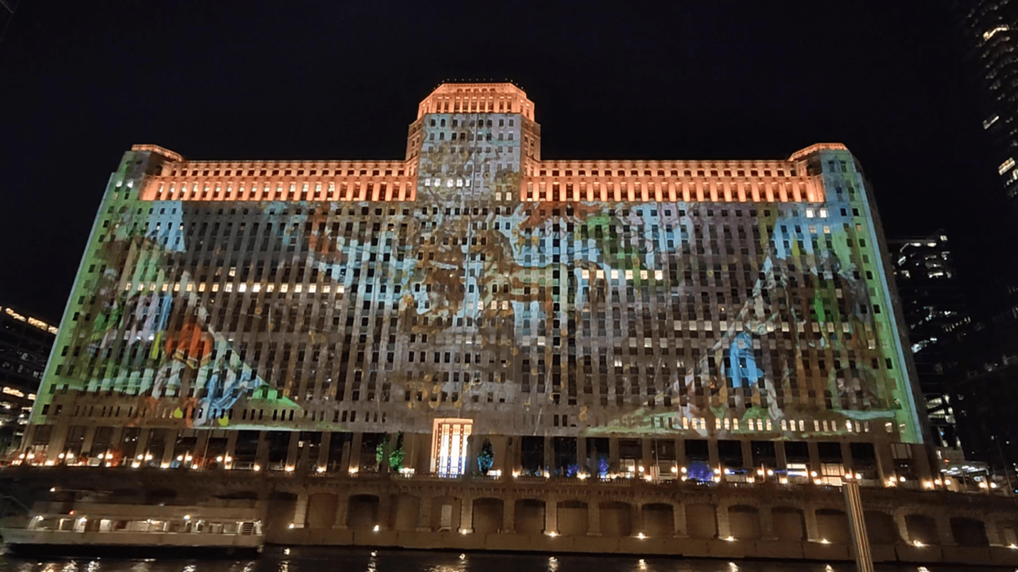
I also produced planetarium shows and designed exhibits. My last project, “Astrographics” for Art on the Mart, was a 2.6-acre, outdoor projection onto a building near the Chicago River. We believe that this is the largest, permanent outdoor digital projection in the world.
I began to see the power of the planetarium as a data visualization environment. Traditionally, a planetarium has been a place to project stars and tell stories about constellations. Planetariums have now evolved into a general-purpose visualization platform to communicate science.
I got more involved with the planetarium community, which led to me becoming president of the International Planetarium Society. A major focus of my presidency was promoting planetariums in Africa.
Why did you come to NASA’s SVS at Goddard?
I came to Goddard in December 2020. I always admired NASA’s SVS and had used their products. I consider the SVS the preeminent group using scientific visualization for public communication.
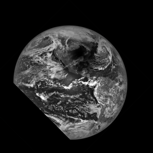
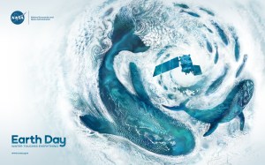
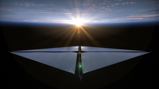
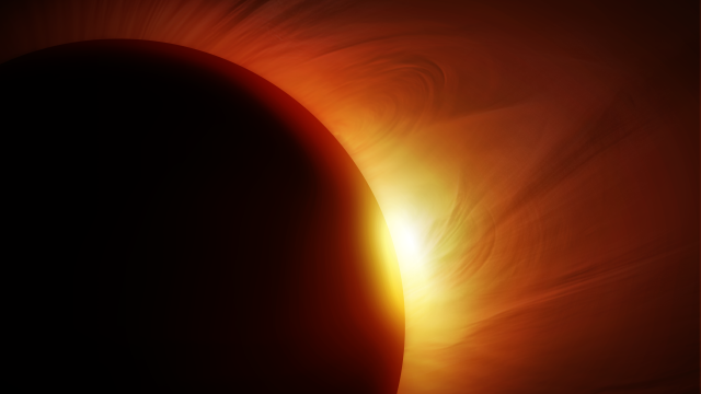
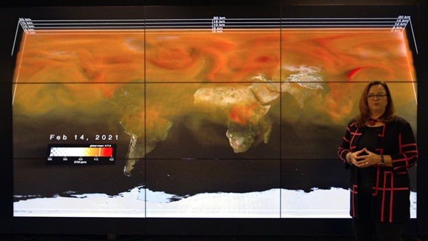
I wanted to work on visualizations for a broader variety of sciences, in particular, climate science. Our group created visualizations for the United Nations Climate Conference (COP26) in Glasgow, Scotland, the fall of 2021. In March 2022, I created a visualization called Climate Spiral, which went viral.
Credits: NASA’s Goddard Space Flight Center / NASA’s Scientific Visualization Studio
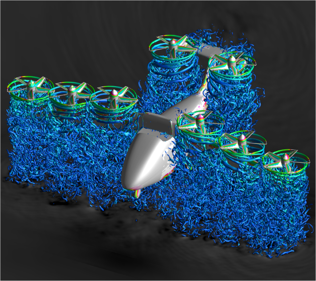
Download high-resolution video and images from NASA’s Scientific Visualization Studio
As the lead, how do you hope to inspire your group?
Our group is very talented, experienced, and self-motivated. Data visualization has recently exploded as a communication tool. Our goal is to continue to stay on top of this rapidly evolving field. Coupled with this, there has been an explosion in scientific data from satellites and super computers. As data becomes bigger and more complex, visualization becomes an even more important tool for understanding that data.
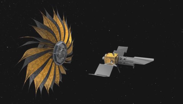
Download high-resolution video and images from NASA’s Scientific Visualization Studio: https://svs.gsfc.nasa.gov/31168
Your work combines art and science. What are the benefits of combining art and science?
One huge benefit is that you can reach people through an artistic visual presentation of science who may not be interested in simply reading an article. You can go beyond teaching people, you can move them emotionally through a good, artistic presentation.
For example, in “Climate Spiral,” we did not want to just inform people that global average temperatures have increased, we wanted people to feel that the temperature has increased.
Also, our universe is just beautiful. Why not let the beauty of the universe create something artistic for you? I sometimes feel like I cheat by letting the universe do my design for me.
What do you do for fun?
Since moving to Maryland, and living near the Chesapeake Bay, I have taken up stand up paddleboarding. I like to cook too. My father is Indian, so I cook a lot of Indian food.
Who inspires you?
Arthur C. Clarke, the science fiction writer, also wrote a lot of popular science. He played a big part in my decision to become a scientist.
Conversations With Goddard is a collection of Q&A profiles highlighting the breadth and depth of NASA’s Goddard Space Flight Center’s talented and diverse workforce. The Conversations have been published twice a month on average since May 2011. Read past editions on Goddard’s “Our People” webpage.
By Elizabeth M. Jarrell
NASA’s Goddard Space Flight Center, Greenbelt, Md.