


The view of Earth from orbit is never the same – from minute to minute, day to day, year to year.
In December of 1999 NASA launched a satellite that opened up a new era in our ability to see, measure and understand Earth. The satellite called Terra rocketed to space on Dec. 18, 1999. (And while it was designed for a five-year mission life – Terra is still up there, collecting invaluable data on Earth’s land, atmosphere and oceans.) In 2002 and 2004, satellites named Aqua and Aura followed. These are often called the three flagship satellites of NASA’s Earth Observing System — which began in earnest with Terra and now comprises a fleet of 18 Earth-observing satellites that have revolutionized our ability to observe our home planet from space.
NASA and other space agencies had launched satellites to study Earth before. But the past 15 years have produced a more comprehensive look at Earth from space than any other period in history. At a time when our planet is undergoing critically important changes, this global view offers not only stunning imagery but also vitally important information about how Earth is changing.
To celebrate 15 successful years of the Earth Observing System, we’ve collected 15 impressive, awe-inducing or simply just plain interesting images gathered by NASA’s three flagship Earth orbiters since the Terra launch.
Enjoy. And here’s to the next 15.
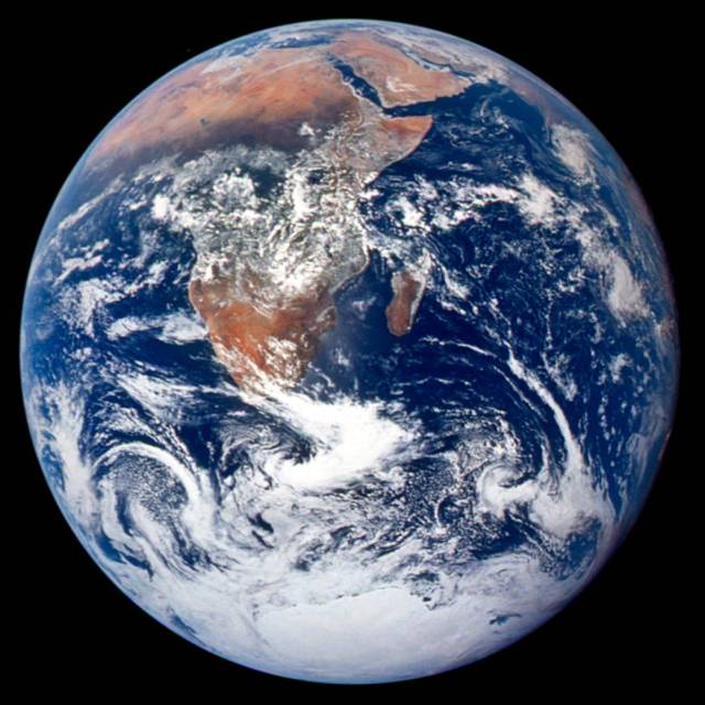
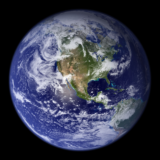
1. Blue Marble 2002
Taking a full photograph of Earth from space takes some doing. In 1972 the crew of Apollo 17 took a camera to the moon to get far enough away to bring the full sphere into view. In 2002, NASA scientists and visualizers stitched together strips of brand new data, in natural color, collected over four months from the Moderate Resolution Imaging Spectroradiometer, or MODIS, instrument aboard Terra. They added a layer of clouds to create this composite Blue Marble that became one of the most iconic Earth images of the new century when Apple selected it as their default background for the iPhone in 2007. A version of the MODIS Blue Marble is now used as the base layer in many visualizations of NASA Earth science data.
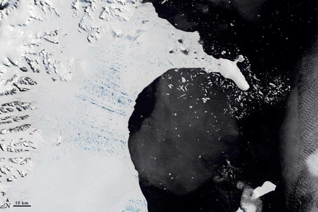
2. Collapse of An Ice Shelf
A mountain range runs up the spine of the Antarctic Peninsula, while ice shelves flank it on either side. Over a period of several months in early 2002, the MODIS instrument on Terra observed one of these ice shelves collapse and disappear, giving scientists and the world a birds-eye view to “see” this dramatic phenomenon. In January, the surface of the Larsen B Ice Shelf – a mass of ice measuring 1,250 square miles, larger than New Hampshire and Vermont combined — appeared pockmarked with ponds of water from melting ice. In mid-February, the front edge of the ice shelf had retreated by about six miles, and large icebergs were splintering off and floating away to sea. By March 7 the shelf had collapsed.
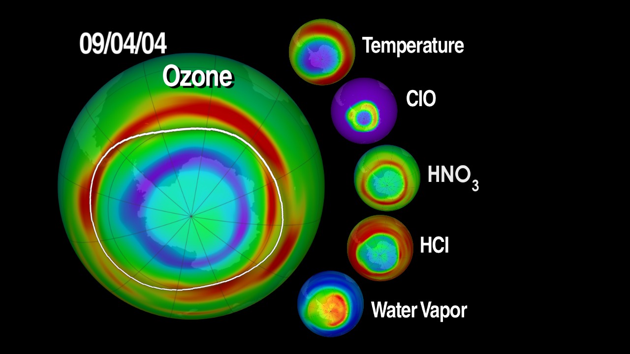
3. Ozone Measurements Out on a Limb
Detecting gas molecules where they occur at different heights in the atmosphere requires going out on a limb – Earth’s limb. From orbit, Earth’s limb is the fuzzy blue halo that appears above the surface. Instruments like the Microwave Limb Sounder on the Aura satellite observe the limb to get a side view of the atmosphere from the ground to where it thins out into space. This perspective allows scientists to measure atmospheric chemistry layer by layer – essential for monitoring the gases that contribute to the hole in the ozone layer and for evaluating the impact of clouds on climate change. The Microwave Limb Sounder was the first to measure, from space, all the gases that are part of the ozone depletion cycle, giving scientists the first observations that revealed the full chemical process of ozone depletion as it occurs.
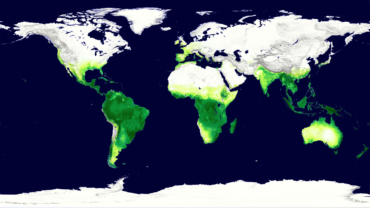
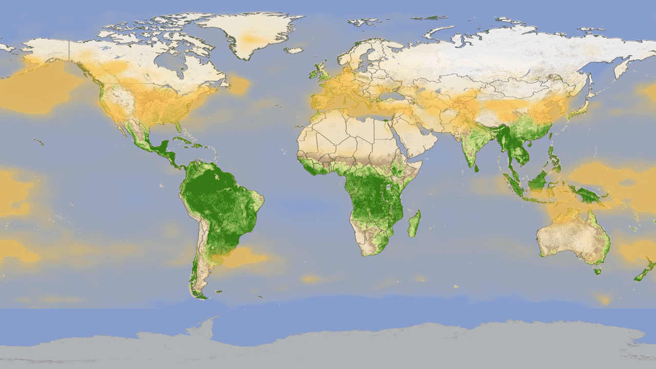
4. Global Vegetation Cycle
The view of Earth from a satellite can give us pictures of where plants and trees grow. But the data from satellite instruments can tell us even more – including how much carbon dioxide plants are absorbing from the atmosphere during photosynthesis. The MODIS instruments on Aqua and Terra measure this carbon absorption, allowing scientists to compare plant productivity around the world. This animation shows what that cycle looks like over the course of the year – the darker green colors show higher rates of carbon absorption, somewhat mimicking the seasonal growth and decline of green vegetation across the planet.
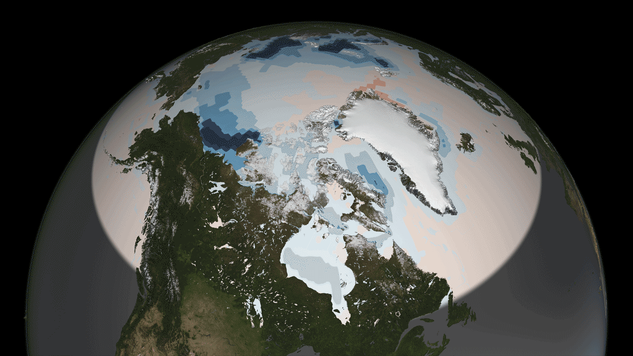
5. Arctic Heating
One of the key concerns about the decrease of summer sea ice in the Arctic is the loss of a white, reflective surface that repels the sun’s energy back to space. Instead, as ice melts and exposes darker ocean waters, which absorb the sun’s energy, potentially enhancing the warming pattern in the Arctic – where temperatures are rising two to three times faster in recent decades than anywhere else on the planet. The Clouds and the Earth’s Radiant Energy Systems, or CERES, instruments on Terra and Aqua have now been measuring the amount of solar radiation absorbed by the Earth since the year 2000. And in the Arctic this absorption has increased by 5 percent in that time – a number that may not seem like much, except when you consider that the absorption rate has been essentially flat across the rest of the globe, and no other region on Earth shows a pattern of change.
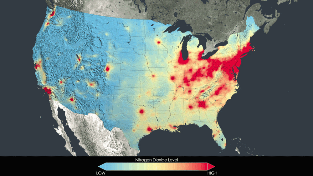
6. Breathing Cleaner in the U.S.
It may come as a surprise, but in many parts of the United States, the quality of the air we breathe has been improving in recent years. As new cars with stricter emissions regulations hit the roads, and as power plants and industry also adhere to tighter pollution limits, some of the key pollutants that can cause health problems have declined significantly in the past 15 years. In more recent years, NASA scientists have figured out how to measure the concentrations of one pollutant – nitrogen dioxide – using the OMI instrument on the Aura satellite. Watch the visualization to see how air quality in the U.S. improved from 2005 to 2011.
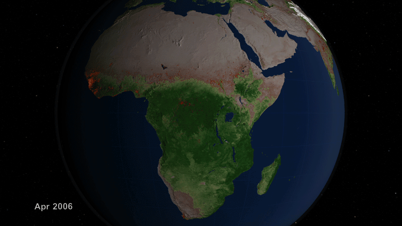
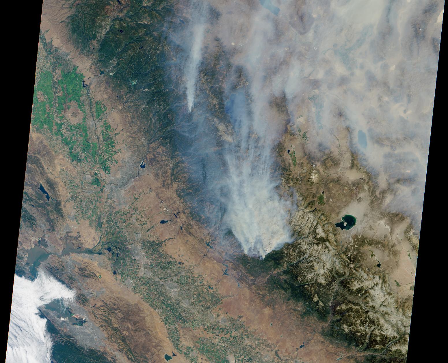
7. Burning Planet
Each year about one third of Earth’s land surface is touched by fire. We didn’t know this fact until the Moderate Resolution Imaging Spectroradiometer, or MODIS, instrument aboard the Terra and Aqua satellites together began scanning Earth four times a day to pinpoint every active fire on the planet. In the fifteen years since they began creating this global fire map, they have observed more than 40 million actively burning fires and revolutionized scientists’ understanding of where fires occur and how they affect ecosystems, carbon released into the atmosphere that contributes to climate change, and air quality that affects human health. The real-time fire map is one of the most in demand products for fighting wildfires in the United States and across the globe.
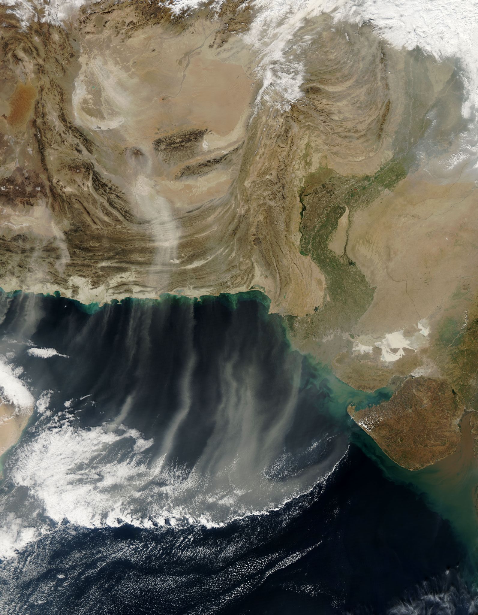
8. Smoke Plumes From Space
The sensors on the flagship satellites can not only detect the heat given off by wildfires, and “count” the number of active fires around the globe at any given time. They also have provided a decade and a half of imagery of active fires and measurements of their smoke plumes. These views of wildfire from space have now become commonplace, but the sensors have provided scientists with real data on how far smoke travels from its source and how high into the atmosphere. The MISR instrument (Multi-angle Imaging Spectroradiometer) on Terra has been instrumental in learning more about how wildfire smoke plumes get “injected” high into the atmosphere and how the plumes mix with clouds.
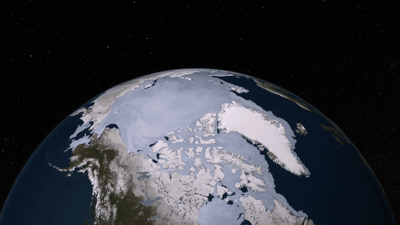
9. Sea Ice Moves
The Aqua satellite was by no means the first to observe sea ice from space. But it was the first to give us such high-resolution data that we could see how something like the Arctic ice cap – a floating layer of sea ice larger than the continental U.S. – moves and changes on a daily basis. Sea ice shrinks in summer and expands in winter – and every day during this cycle it takes on a slightly different shape. The AMSR-E instrument – Advanced Microwave Scanning Radiometer for EOS – showed us how beautiful a sight this could be. It has also measured the continued decline in summer sea ice in the Arctic.
10. Carbon Dioxide Waxes and Wanes
Ground-based sensors told us that carbon dioxide in the atmosphere rises and falls in sync with winter and summer in the Northern Hemisphere. This cycle is linked to the photosynthetic activity of plants, trees and phytoplankton. But without a global view from a satellite, we’d never seen a picture of what these fluctuations would look like. The AIRS – Atmospheric Infrared Sounder – instrument on Aqua measured carbon dioxide a few thousand feet above the surface. And a visualization of that data gave us a glimpse of exactly how the greenhouse gas is distributed around the globe and how its concentrations change with the seasons.
11. The Mysteries of Clouds and Aerosols
The two variables that still create the most uncertainty about how future climate change will unfold are clouds and tiny airborne particles called aerosols. Some clouds reflect the sun’s rays while others trap outgoing heat that would otherwise be emitted to space. Likewise, some aerosols scatter light and cause a cooling effect while others absorb light and cause a heating effect. Aerosols can also seed clouds, further complicating the picture. Scientists have used the MODIS instruments on Terra and Aqua to begin a continuous, long-term record of clouds and aerosols that will ultimately help the science community better understand their mysterious ways. In more recent years, other NASA satellites have been launched to fly in tight formations with Terra and Aqua – providing complementary views of clouds and aerosols from different types of instruments.
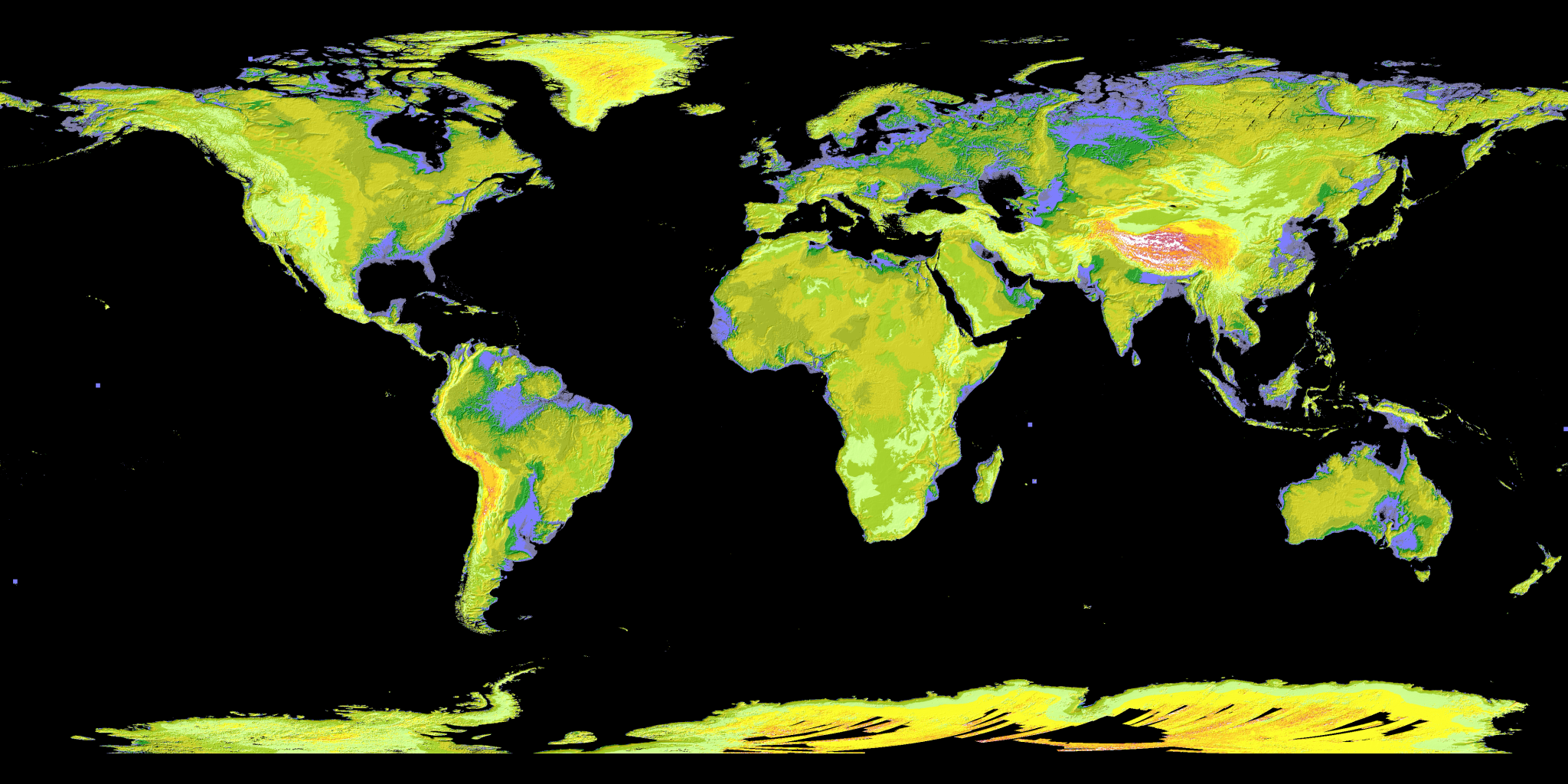
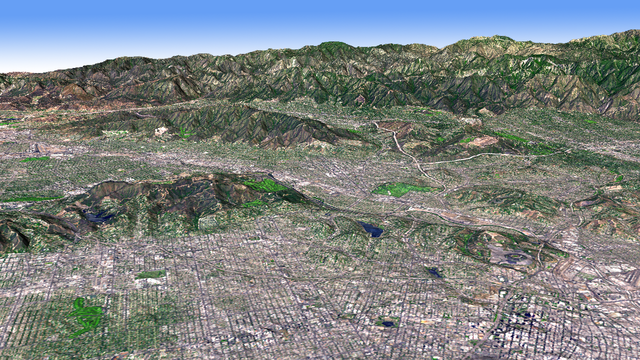
12. Top that Topo Map
Explorers have long gone forth and mapped the terrain of unknown territory, producing detailed topographic maps of mountains, rivers, hills, and plains. The Global Digital Elevation Models produced by the Advanced Spaceborne Thermal Emission and Reflection Radiometer, or ASTER, instrument aboard Terra, however, takes it to a whole new level. Among its capabilities, ASTER collects pairs of slightly offset images of Earth’s surface. The image pairs work like our eyes – the slightly offset images give information about depth and allow scientists to visualize the Earth’s terrain in 3D. The first Global Digital Elevation Model was released in 2009, stitched together from of 1.3 million scenes of the land surface. No more piecing together maps made by different people in different eras, it was the highest resolution topographic map, which covered 90 percent of Earth’s surface consistently from nearly pole to pole. Scientists use elevation data to understand how the land changes over time, especially from natural disasters like landslides, earthquakes, floods, and tsunamis.
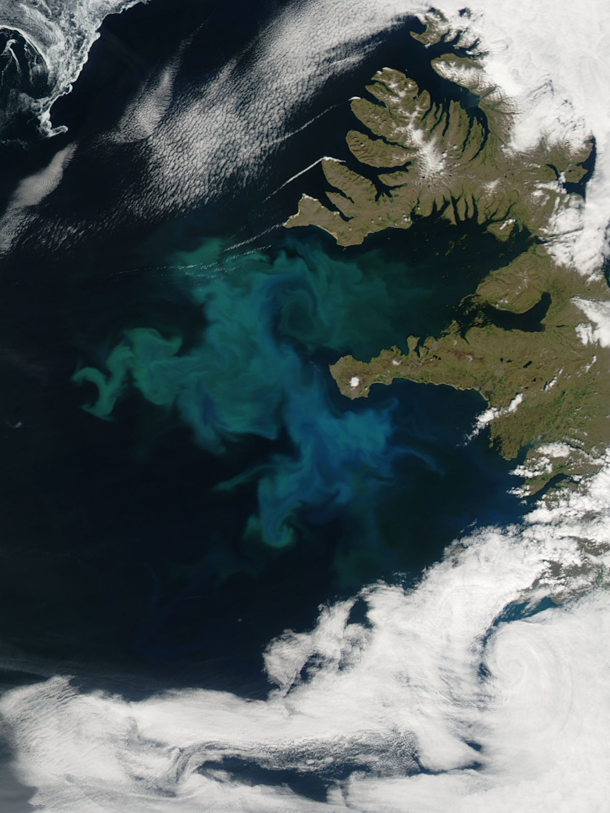
13. Dance of the Plankton
When tiny plants in the ocean bloom, they bloom for hundreds of miles. Phytoplankton, the base of the marine food chain, explode in population when cold, nutrient-rich waters from rivers or the deep ocean rise and mix with sun-lit surface waters. Globally, phytoplankton blooms account for about half of the net photosynthesis on Earth and are major players in taking carbon out of the atmosphere and transferring it to the ocean. With the bloom comes a feeding frenzy, as fish and marine mammals flock to the microscopic feast that supports their populations that in turn support the human demand for fish. Daily ocean color measurements from the MODIS instruments aboard the Terra and Aqua satellites have dramatically changed scientists’ understanding of the complex biological and physical relationships between phytoplankton, marine ecosystems, and the global carbon budget.
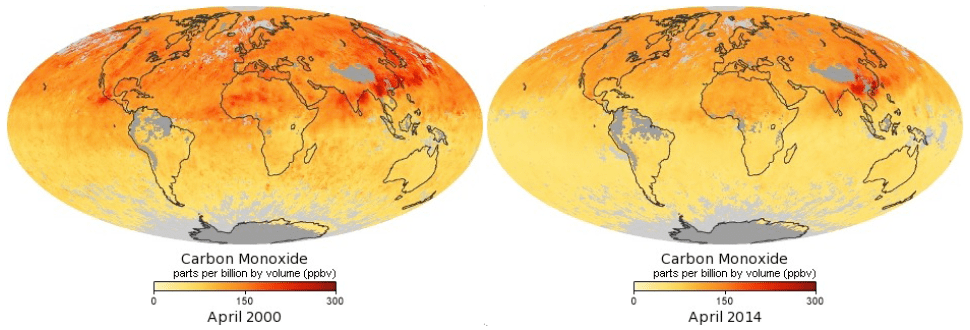
14. Mapping Carbon Monoxide
Carbon monoxide is a colorless, odorless pollutant that emerges from wildfires, vehicle tailpipes and other human sources. Once in the atmosphere it is one of the ingredients for ground-level ozone, a harmful pollutant that contributes to smog – sometimes thousands of miles from where the carbon monoxide originated. An instrument on Terra called Measurements of Pollutants in the Troposphere, or MOPITT, was the first dedicated to tracking sources of carbon monoxide and following the gas across the globe. And the news is good. With MOPITT data, combined with data from the Atmospheric Infrared Sounder, or AIRS, on Aqua and the Tropospheric Emissions Spectrometer, or Tes, on Aura, as well as European satellite data, scientists have found that carbon monoxide emissions have declined at a rate of one percent per year since 2000.
15. Repairing the Ozone Hole
The 1987 Montreal Protocol banned the use of ozone-depleting chemicals and was a landmark moment for the international community to come together and tackle a serious environmental threat. The ozone layer, high in the atmosphere, acts like sunscreen for Earth, protecting every living thing on the surface from the sun’s harmful radiation. Satellite measurements of stratospheric ozone have been essential for monitoring the seasonal appearance of the ozone hole over Antarctica. Continuing measurements begun by NOAA satellites, the Ozone Monitoring Instrument on the Aura satellite has witnessed the stabilization and earliest signs of shrinking that signal the hole in the ozone is on the road to recovery.

Ellen Gray and Patrick Lynch
NASA’s Earth Science News Team