


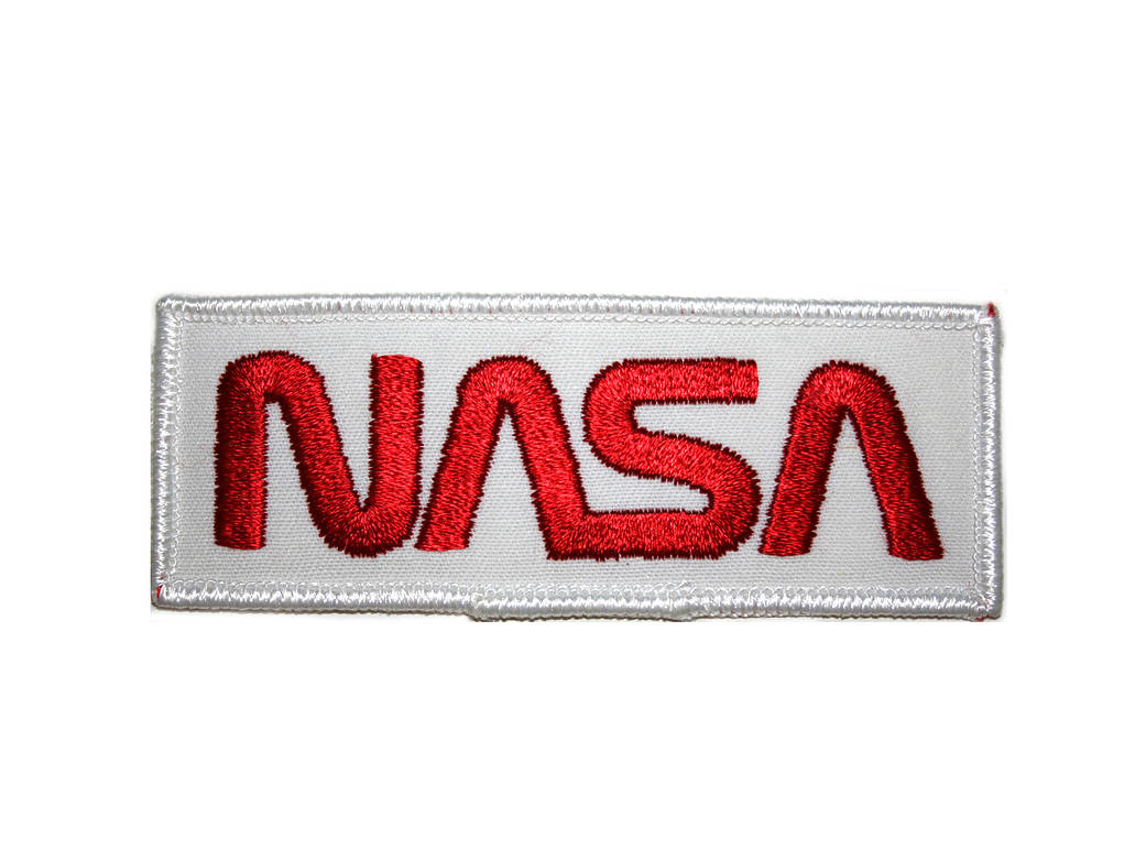
Title: NASA “Worm” Logo
Designer: Federal Design Improvement Program
Year it was designed: circa 1975
Explanation or story behind the patch: The NASA Logotype appearing on the front of the main building replaced the NASA Insignia. The NASA Logotype was developed under the Federal Design Improvement Program initiated by the President in 1972, with the preferred color being red. It was approved by the Commission of Fine Arts and the NASA Administrator in October 1975. It symbolized NASA’s role in aeronautics and space from 1975 to 1992 and has since been retired. In the logotype, the letters “NASA” are reduced with the strokes being of one width; the elimination of cross strokes in the two “A” letters imparts a quality of uniqueness and contemporary character. This familiar logo was known as “The Worm”.