


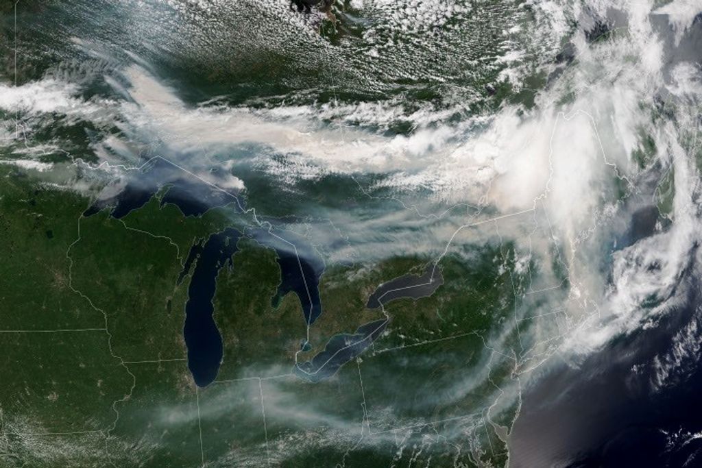


The coronavirus pandemic has changed the way we live, and several studies have documented how those widespread changes in human behavior have impacted the environment. NASA scientists and others using data from NASA and our partner satellites have shown that air pollution levels dropped significantly during COVID-19. A new, NASA-funded study, conducted by scientists at The George Washington University (GW) in Washington, D.C., zoomed in on the 15 largest metropolitan areas in the United States to see how the drop in air pollution differed from neighborhood to neighborhood. The paper was published July 20 in the journal Proceedings of the National Academy of Sciences.
We talked to the lead author on the study, Gaige Kerr, about how the COVID-19 pandemic led to better air quality – and how those improvements were unequal for people of different races, ethnicities and socioeconomic levels. Kerr is a research scientist at GW. The interview has been lightly edited for clarity.
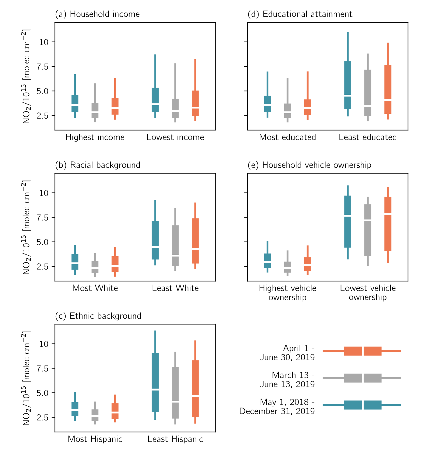
What is nitrogen dioxide and how is it related to air quality?
Nitrogen dioxide, or NO2, is a trace gas in the atmosphere. It’s one of the six air pollutants regulated by the U.S. Environmental Protection Agency (EPA) under the Clean Air Act. Even though NO2 is only present in small amounts, it’s very harmful for human health and can trigger respiratory illnesses like asthma. NO2 also leads to the formation of ozone near Earth’s surface, another harmful air pollutant.
NO2 can come from natural things like lightning or microbes in the soil. But in cities, the majority of NO2 stems from human activity and fossil fuel combustion. Roughly 50% of the ambient NO2 comes from traffic emissions. The other large sources come from power plants, incinerators and factories.
What happened with NO2 levels when the COVID-19 pandemic triggered lockdowns in March 2020?
During COVID, we had the opportunity to see how taking many cars off of the road and planes out of the skies affected air pollution in the real world in this unintended experiment. We know from past research that there are NO2 pollution disparities based on several factors – most notably race, ethnicity and income – and that communities of color and lower socioeconomic status face much higher concentrations of NO2. So, we wanted to understand how this unprecedented, extraordinary drop in human activity and emissions impacted NO2 disparities.
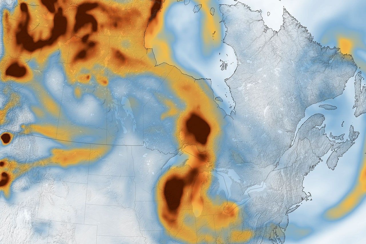
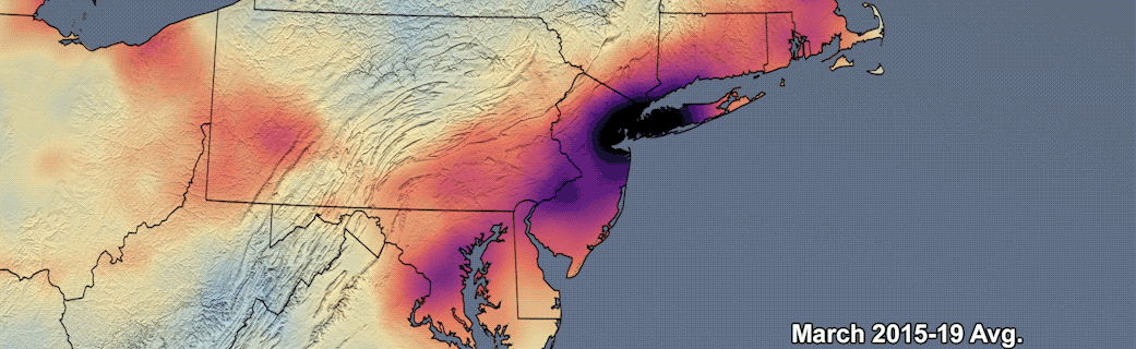
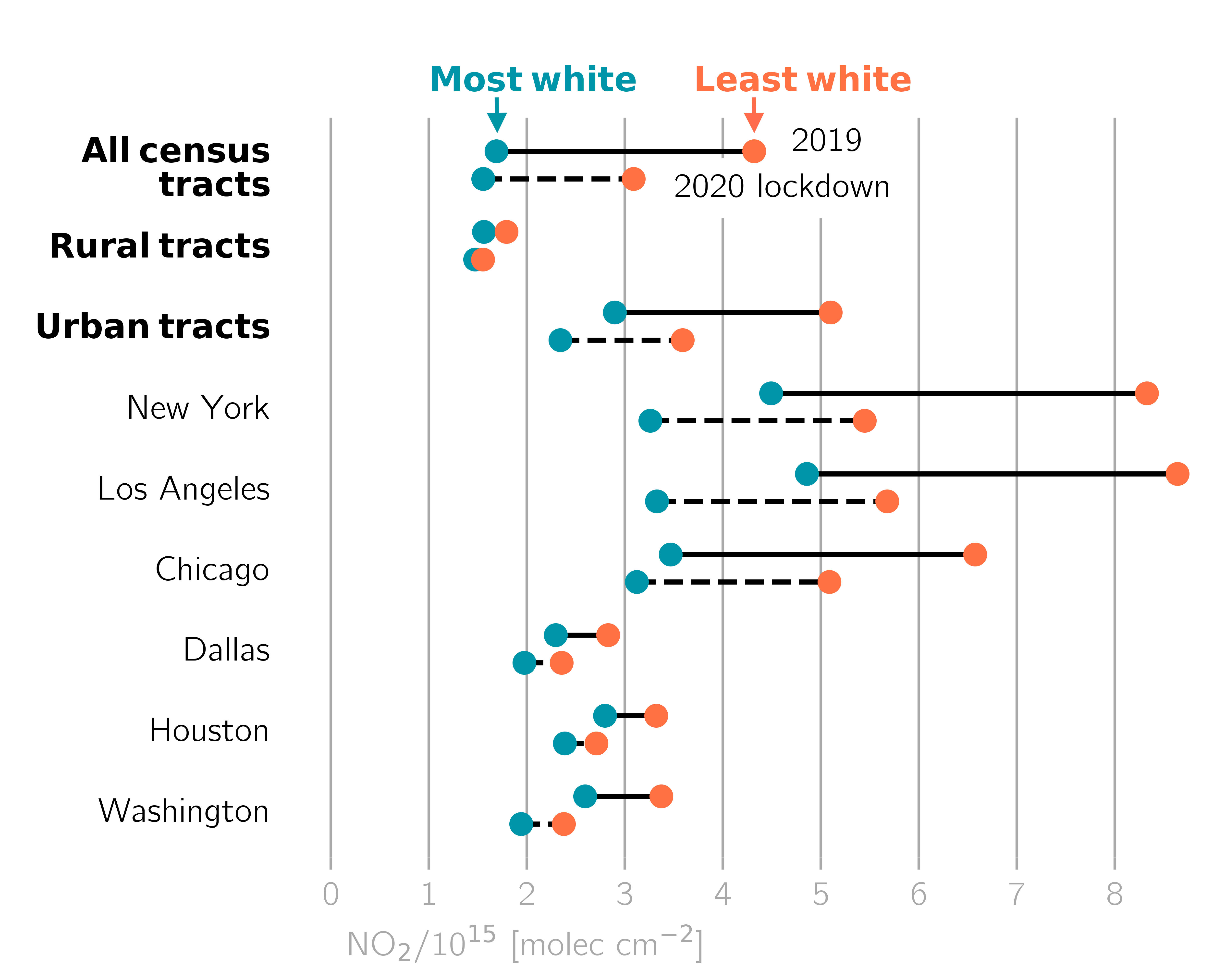
In cities, NO2 levels plummeted at first. That had a lot to do with the drop in traffic and travel, since vehicle traffic is the largest contributor to NO2 in cities. We saw widespread decreases in NO2 across urban areas in the United States during the pandemic, but the magnitude varied. NO2 levels dropped by about 10% to 35% on average, depending on the city. New York City and Los Angeles had very large drops, but NO2 disparities across different racial, ethnic and socioeconomic groups were very large in these cities.
How did you determine NO2 levels for different neighborhoods?
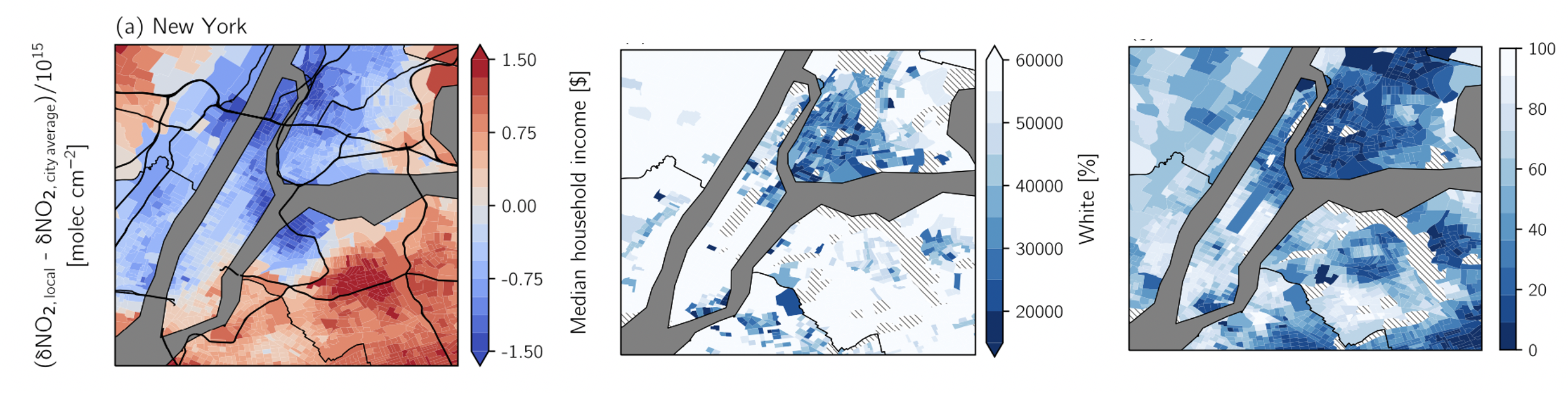
We used data from the TROPOspheric Monitoring Instrument (TROPOMI) on the European Commission’s Copernicus Sentinel-5P satellite. With TROPOMI, in near real time, we can look at NO2 levels in the atmosphere at a very high resolution – like neighborhood by neighborhood. We compared TROPOMI’s NO2 measurements with data from the U.S. Census Bureau from the American Community Survey. We collected all of the satellite measurements within a census tract – which we can think of as the size of a small neighborhood – and paired that with the demographic data like race and ethnicity, median household income, education level and vehicle ownership.
What trends did you see when you looked at how the drop in NO2 differed between neighborhoods?
The largest decreases in NO2 level occurred in the metropolitan area neighborhoods with a larger non-white population. But even with these large reductions, the levels of NO2 in those areas during the pandemic were still higher than the pre-pandemic levels of NO2 in the neighborhoods with a higher percentage of white residents. In many of the cities we examined, there was no change in the size of NO2 disparities between the most and least white or the highest or lowest income neighborhoods, despite an overall decrease in NO2.
Your team analyzed NO2 levels in the 15 largest metropolitan areas in the United States. Did you see this result in all of them?
Yes, we saw widespread decreases in NO2 across urban areas in the United States during the pandemic, but the magnitude varied. NO2 levels dropped by roughly 10% to 35% depending on the city.
We also did a deep dive into Detroit, New York, and Atlanta by looking at maps of NO2 data and overlaying that with information from the U.S. Census Bureau. For example, in Detroit, we found the largest NO2 drops were along the Detroit River. When we looked at what pollution sources lie around these neighborhoods, we saw that they were boxed in by a very busy interstate on one side and, on the other side, one of the busiest border crossings in North America, from Detroit to Windsor, Ontario, in Canada. There’s usually a lot of heavy-duty trucks idling at the border crossing, waiting for their turn to get through customs and border patrol. So, it makes sense why we saw some of the largest NO2 drops in those neighborhoods in Detroit.
In New York City, we found that the largest decrease in NO2 pollution occurred in Harlem and the Bronx. This part of the city has been referred to as “asthma alley” due to asthma rates well above the national and state average. These neighborhoods and their citizens, who are primarily Black and Hispanic, face a barrage of pollution from heavy-duty trucking and industry.
In Atlanta, the largest NO2 drops were in the southwest part of the city where there’s a large international airport. That part of the city is also home to a majority black and low-income population. In addition to all of the highways and interstates in that part of the city, it’s likely that emissions related to aviation are contributing to the NO2 drops. The Guardian reported that in March of 2020 around 50% of flights had been cancelled from Atlanta. So, there was not only a lot less vehicle traffic to the airport but also fewer planes flying in and out of the airport.
So, even with the improvements in air quality during the pandemic, NO2 levels for communities of color were still higher than the pre-pandemic NO2 levels for the whitest communities. What might be driving that discrepancy?
When we looked at the distribution of major roads in relation to each census tract, we found that the areas with the biggest drops in NO2 had about nine to 10 times more highways and interstates nearby than the census tracts with the smallest drops. The neighborhoods with a larger non-white population have about five or six times more highways and interstates nearby than the most-white neighborhoods.
Something else I thought was really interesting is that we found that census tracts with very low vehicle ownership in low-income communities and communities of color had some of the largest NO2 drops during the lockdown. This suggests that some of the air pollution experienced by people living in these areas is not caused by their own consumption of fossil fuels that produce air pollutants like NO2.
Download the full visuals from NASA Goddard’s Scientific Visualization Studio.
By Sofie Bates