


If you’re fascinated by the idea of humans traveling through space and curious about how that all works, you’ve come to the right place.
“Houston We Have a Podcast” is the official podcast of the NASA Johnson Space Center from Houston, Texas, home for NASA’s astronauts and Mission Control Center. Listen to the brightest minds of America’s space agency – astronauts, engineers, scientists and program leaders – discuss exciting topics in engineering, science and technology, sharing their personal stories and expertise on every aspect of human spaceflight. Learn more about how the work being done will help send humans forward to the Moon and on to Mars in the Artemis program.
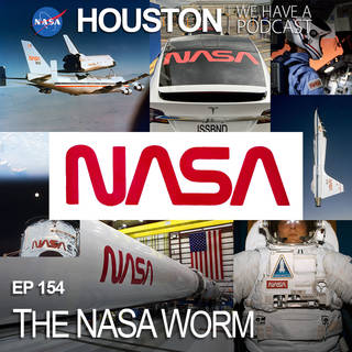
For Episode 154, Richard Danne, designer and creator of NASA’s “worm”, details the origins of the iconic logo, the inspiration, the design process with the agency and his firm, Danne and Blackburn, and its reception once being introduced. Retired in 1992, NASA reinstated the “worm” in May 2020 during the SpaceX Demo-2 mission. This episode was recorded on June 25, 2020.
Transcript
Gary Jordan (Host): Houston, we have a podcast. Welcome to the official podcast of the NASA Johnson Space Center, Episode 154, “The NASA Worm.” I’m Gary Jordan, and I’ll be your host today. On this podcast we bring in the experts, scientists, engineers, astronauts, even artists, all to let you know what’s going on in the world of human spaceflight. The worm is back! Now, before you start practicing your dance moves, I’m talking about the NASA worm logo. You’d recognize it if you saw it. It’s that retro looking logo where N-A-S-A is spelled out in red. We call that one the worm, and the blue one is called the meatball, at least informally. In the official NASA style guide, the meatball is called the insignia and the worm is called the logotype. The worm has been retired for almost 30 years, and any official NASA product in that time has been branded with just the meatball. But just prior to the launch of NASA’s SpaceX Demo-2 mission in May 2020, NASA brought back the use of the worm, and it’s now being used for select missions and products. The worm design is super famous, and even though it’s been retired, it’s still very much part of pop culture. With a new era of human spaceflight upon us, the worm is making a comeback. So, to describe this logotype and its history is the very man who designed it, Richard Danne. It was he and his firm, Danne and Blackburn, that was selected for NASA’s rebranding in the mid-70s. Richard is an extremely experienced and award-winning graphic designer, and on this podcast, he describes the journey from the worm’s creation to now and what it means for NASA’s future now that it’s back. So here we go. The NASA worm logotype with Richard Danne. Enjoy.
[ Music]
Host: Richard Danne, thank you so much for coming on Houston We Have a Podcast today.
Richard Danne: Hey, Gary. It’s great to be with you, and thanks for the invitation.
Host: What an honor to be talking to you sir, the person who invented such an iconic logo. I want to take it from really the very beginning, really just a brief, I guess summary of your biography up to the time that you started working with NASA just to understand who you are and where you come from.
Richard Danne: OK, sounds fine. Well, I have an unusual background, so let me give you very briefly give you some of that history. I was born on a farm in Oklahoma in, believe it or not, 1934. Well, that significant date because you know, it’s the middle of the Great Depression, and the overlay, which were quite fierce, was the dust bowl Oklahoma, and frankly Gary, I don’t recommend that. [laughter] As a start, you know what I mean? But on the other hand, it was a great beginning because everything went up from there, you know upwards. So, the youngest of four children, and I was a good student and very involved in music. I played in all the bands and even in a jazz quartet in high school, which is great fun. So, we worked high school events and dances. We had no art, but I drew constantly. So, you know, this is an early warning of what I was going to do with my life I think, and then we went on to college. Of course, I attended Oklahoma State University. Starting in engineering, which was something my folks wanted me to do [laughter] at OU. I didn’t like it, although I think it played a great role in my career, frankly. So, I don’t feel that was a waste of time. I switched to art, because no design was offered at Oklahoma State. I also had a jazz quartet in college. I came within literally within a whisker of pursuing music as a career. I am awfully glad that I chose design, but I didn’t know that OSU was not proper background and it wasn’t good enough. So, one of my professors helped me get located at UCLA grad school. So immediately on my graduation I drove straight out to UCLA and started specializing in design. Thank God, because it all worked, so it was great, and then the other caveat to this is, I began my freelance career in Dallas, and my entire six-decade career has been independent practice, and I’m very proud of that. So then on to New York in 1963 and that’s when we really got involved in some of the really big stuff.
Host: Like what, were some of the first things that you started tackling?
Richard Danne: Well, we did real life before NASA. It was you know, I was freelancing, so I started with anything I could get book jackets and peripheral stuff like that. However, we very quickly got into corporate work and worked with people like U.S. Information Agency right there in Washington and General Dynamics, which kind of got me into this world of aerospace so to speak, Ford Foundation; Time, Inc., worked for Westinghouse, and, you know, some really good names. So, at that time, the field was wide open and for someone like me to start freelance in New York was almost unheard of, or you wouldn’t do it today, let me say that Gary. It just would be impossible, but that was sort of the background, you know, and it all happened pretty fast, and not to say it wasn’t hard work, but it was great. It was a lot of fun too.
Host: So, I mean it sounds like you got into the world of aerospace even early on in your career, but I’m kind of curious, you said you were drawing back in Oklahoma. What were those things that you were drawing? What were you interested in putting on —
Richard Danne: It was pretty interesting. That’s a great question, actually. I was drawing mostly cars, and I could have gone in that direction too, automotive design. Of course, I drew planes too and athletes. It was the era of Bud Wilkinson at Oklahoma University, and so you know, great football teams, and I’d draw the athletes, but I think I just kept returning to cars and I carved them too out of wood, you know? And real modern designs that people thought were very ambitious and great stuff, but I mean I think it was all pointed in this direction, you know? It wasn’t-
Host: Yeah.
Richard Danne: It wasn’t exactly peripheral. It was really good.
Host: Very much so. So, I can see maybe about that push from your parents to go into engineering, but you said that just didn’t work for you, you were more passionate about art. What was it, what was it about art or maybe a lack thereof within engineering that made you want to pursue the path that you did?
Richard Danne: Well, you know, in college and, of course, you meet all the other students, and you become acquainted with what’s being offered, but I always had the music and art. That was really my thrust from time I was a little boy, and as I say I carved stuff constantly. I was always drawing. So, in college I became aware, through other students, what they were doing and then I just thought they were having a lot better time than I was, and I did have quite a bit of ability. I could paint, so I started looking into that program, and I actually switched in my sophomore year. And I was very happy for the rest of the college experience, but I still wasn’t meant to be an engineer, and what’s fascinating about that is I will get into this later, but I had worked with engineers and scientists a great deal of my career. It wasn’t just NASA, and so and it all fits. I think when you have that orientation or I could have done that, it’s a platform kind of thing, you know? And it’s a good place to start from a good launch pad, if you will.
Host: Very nice. I want to skip ahead to NASA. The kind of the base of this is this logo, but to sort of give a little bit of background for our listeners, we’re talking about two logos that are the, I guess identifiers of NASA. Can you describe what they are and what they look like?
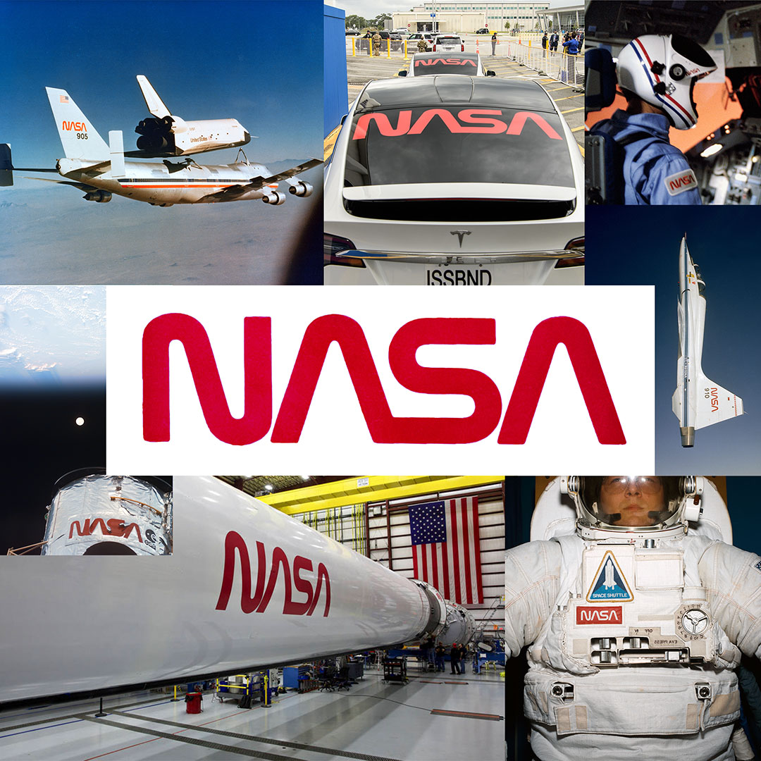
Richard Danne: Yeah, there are two marks for the agency. It was only one then, and it was called the meatball, affectionately called the meatball, and it was a blue sphere with kind of a chevron shape and then a wedge shape with an ellipse around it and a sprinkling of stars in the middle. So, it’s very allegorical sort of a story telling symbol. When we came in, the design when we saw the cross-section of work being done by all the centers, we went the other way and decided we needed something very, very simple that can anchor the whole program, but so the worm, which is also an affectionate term now, the logotype. It’s a warm red logo with custom letters, which of course are one stroke letters suggesting technology, propulsion lift, and our intention was for it to suggest the future without hyping it, you know? And make it very, very useful, and that’s the way that worked out.
Host: So, let’s dive a little bit into the history here.
Richard Danne: Sure.
Host: There was a transition point, you know, from we talked a lot on this podcast just about the Apollo missions, and if you were to watch any of those missions, that meatball that you’re discussing, that was the logo. That was the one that everyone was tied to.
Richard Danne: Exactly.
Host: But around, I believe it was 1974 was the time that you started coming in, and they were looking for a redesign. Tell me a little bit about that.
Richard Danne: Yeah, the Apollo program, which by the way, I was glued to the set all the time. So even since I’m a little boy I love flight, and then of course space exploration just hooked me completely. So, I did follow the Apollo program and was very involved before we got the call, so to speak. But for the agency, you know, they were no easy headlines after Apollo. There’s no publicity coming automatically, and it was a very quiet time for the agency, and I think they were very nervous, anxiously awaiting really the shuttle program to kick in, and I can understand it because it had been so easy with the Walter Cronkite’s of the world, you know, hyping and making it happen, but this is very quiet. I think it’s one of the reasons that this program was initiated was to fill that void, but it really wasn’t the designer’s idea. It was a National Endowment of the Arts. They created, the NEA is short. They created a program called Federal Design Improvement Program, and they felt the federal graphics were very weak and behind and, of course, that’s true. So, they took it upon themselves to do research missions on every agency and collect, you know archival data and everything that the agencies were doing, and they evaluated it and decided whether the agency should have a redesign or not. And one of the very first ones they wanted to attack was the NASA, and the reason was it was such a high profile, and so they wanted to, they thought if they could get an early victory with NASA then all the other agencies would follow. Of course, that’s exactly what happened.
Host: So, you know, that was a big deal then. This was very forward leaning at the time, so how did, how did Danne and Blackburn get selected?
Richard Danne: Well —
Host: Danne, sorry.
Richard Danne: We were only formed either the fall before we got the call, and actually that would have been in 1973. Danne and Blackburn was less than a year old when we got the RFP, but my partner, Bruce Blackburn, had been with Chermayeff & Geismer [now Chermayeff & Geismer & Haviv], a rather famous firm, and he had recently designed the U.S. Bicentennial symbol while he was there and NEA was very, very fond of that mark, and I think to this day, I believe that was the main reason that we made the short list. And it’s interesting, Gary, that at that time because it was early on, they only invited seven or eight firms. Down the road, and we did a number of other programs, it just kept growing geographically, I mean geometrically. So, you know, each time they almost doubled the number of candidates they brought in to bid on the jobs, but we were, as I say, so we were called very early on, and I think Bicentennial was the key.
Host: Wonderful, now when they did bring you on, I’m sure they had some visions of what they wanted. What were those key elements they wanted? You already mentioned a few. They wanted the future, they wanted something about lift. What were those key elements they wanted for this new, for this new design?
Richard Danne: Well, it’s interesting because I don’t know that NASA, and I think they were fairly typical of those early agencies. I don’t know that they felt they needed a redesign, particularly. Though, they knew they were in a bit of trouble. They certainly needed more publicity and a symbolic kind of a hype of some kind, and so you know — what NEA wanted them, after they looked at their collateral archival work, they were shocked as we were. We saw it and we couldn’t believe it’s coming out of the space agency. What had happened though is, I mean the centers were still independent. Yes, they were part of NASA, but they behaved pretty much on their own. They really weren’t happy with anything that came out of Washington at that time, and it’s funny because even to this very day I know the centers are very competitive and I get that. I think it’s a good thing, probably, but it was everything from funding on, you know? So basically, just they all think they’re wonderful, and I think they are too. So, but the net of that is that the work was extremely desperate and messy. It was low standard, and the reason was they didn’t have a single graphic designer on staff of any of the centers. Maybe JPL, which did exceptional work compared to the other centers. So, it’s a wild west of graphics and, you know, it’s anything goes, and so I think Headquarters kind of got religion in a hurry and realized that they had to pull all this together, that they couldn’t have ten or eleven centers looking like, you know desperate and having their own family style. So, our job was really to pull it altogether. As I like to say, one NASA, one agency. That was the mission. It went beyond aesthetics. It was really the goal of the whole organization to try to meld them from the old NACA days, you know? Into one NASA and that’s a pretty big charge actually, and it can’t be done just with graphics, but it can help, and that’s what we were challenged to do.
Host: Now, of course, you started with that work, and you already mentioned some of the values that you wanted in this new logo. Simplicity was one of them. I know one of the challenges with the meatball itself was there was problems reproducing it and putting it onto things, and having this simpler logo made it a little easier to put on things. Is that right?
Richard Danne: That’s absolutely true. Of course, the [Government Printing Office] GPO, I can say this now because they did very substandard work at that time, and the meatball didn’t help because it was very complicated and it was in multicolors and, you know, it sometimes it reproduced like a thumbprint, you know? It just, it couldn’t be done. So, and I should quickly add that I am told, I don’t have personal experience. The GPO does much better work today. Also, the original meatball was a little more complicated than it is today. So, it had more going on in it, and it made it even hard to reproduce. So, our — we settled on we took a month of honing our logotype, making it more contemporary and anchor the program. So, we used across the board in all mediums, and so part of our presentation was to show it to them. Publications, forms, signing, vehicles, aircraft, shuttle, you know, even exotic spacecraft, and that standards manual, well, actually the presentation was in fall of ’74. A manual came out in 1975, but that was what we were trying to do was to create something that was going to last a long, long time and would anchor this all this desperate work. It wasn’t an easy task, but it was exciting because this is the super agency, which don’t get me started. I’m just as excited about it today as I was back then.
Host: [laughter] Well, this is curious. You talk about the stakes here about this logo, but as I understand it, you presented one solution when you actually designed this. Is that right?
Richard Danne: That’s true, and that was very controversial at the time, and everybody would agree that it would be controversial today. In fact, most design firms present multiples. We still kind of adhere to the idea that there’s a best solution, and we show that first and more often than not the client says yes, but that was very risky. What we did do that was different, it wasn’t a requirement in our contract at all. We did about 25 demonstrations at great time and expense showing what it would look like on everything, you know, every two dimensional, every three-dimensional item that I just mentioned. Timing vehicles, aircraft, shuttle, you know it and we played it out against this backdrop to make it a true, what I call cap[ital]-P Program. Prior to that, you know, the meatball had been kind of like an ornamental stamp, you know what I mean? It was just applied to buy subcontractors, not just by NASA of course. To everything that moved they’d just stick it on. So, what we needed was, you know, a family program that would bring it altogether and make it work. We even used it as a stem word. You’re probably aware of that like NASA news or NASA information, and it really did extend itself beautifully, and this is what happened. And you know, that was the difference in the presentation. I think the logo itself was very controversial to the group that we presented to, but when we start trotting out the demonstrations, and you could just see the difference in their reacceptance in the room. You know, it was just very emotional because it’s the first time they’d really seen what it could be, how expansive the program could be, and how cohesive you know, so all one agency.
Host: That part of the story really is interesting, the reaction to this. I’m sure you have folks that have been there from the Apollo era that maybe were in love with the meatball and did not want to change. There was a little bit of, a little bit of push back there, and I know specifically two names that come to mind or that I found, James Fletcher and George Low had opinions of their own on just the color scheme and all kinds of things. It was not a, you know, it was not a universally accepted thing.
Richard Danne: No, and the decision was certainly among the most interesting I’ve ever experience, and the stakes were extremely high. I think that both of them being scientists, as probably today would be the case, they viewed things through that lens rather than through an art or acidic lens, but you know, so there’s a lot of controversy. I know Dr. Fletcher, and I say this in all generosity because he’s a great guy and we did wonderful work with him over the years, just didn’t get it, and I know when he saw the mark and they came back, and Dr. Low was talking to me. I said well, what do you think? And he said, “well, I think something’s missing here,” and you know Dr. Low says, “well, what is that? “He says, “well, there are no cross strokes in the A’s,” and Dr. Low said, “well, yes, so what’s wrong?” He says, “well, I don’t feel we’re getting our money’s worth,” and you know, the fact is that that’s one view of it. It was a pretty Spartan rendering, you know? And now today, you see this copy over and over and over. In my lectures I do a thing on copycat culture. You know, thousands of marks are out there. They imitate this, but so that was one thing. The other thing was this warm red that we used, which I think Dr. [James] Fletcher thought, he commented that he thought blue would be more appropriate because space is blue, and then he was corrected by Dr. [George] Low saying no, space is black. So, there were a lot of things that we knew that they’d want blue. In fact, a lot of our early work was based on that color scheme, you know, that palette, but we thought that this warm red was indicative of a real can-do agency and certainly NASA was that. And so, but in the end, we prevailed, and they got the logic of it. Here again, sort of an engineering orientation logic rather than just a gut, you know aesthetics. So, you know, it did work, and we got the go ahead to do the program.
Host: Well, wonderful. Tell me about that. Now I know like, you know you talked about already you alluded to many elements of how the logotype would actually appear on certain things and this beautiful thing called the style guide. So, tell me about that process.
Richard Danne: Well, the programs like this were done in the corporate world, but nothing really in the institutional world, and certainly nothing of this scale or magnitude. So, we were adopting things that were very common place in a corporate world. That was to create a document style manual that would be used by just everybody. All staffers, all the specialists, and certainly inside and out the agency, and NASA was unique in that it had, you know, tons of subcontractors who were very important partners, and they were kind of used to doing whatever they wanted too. So, we had to create a manual that was pretty, not only well defined, but it was fairly strict in the sense that, you know, that we had do’s and don’ts and we’re trying to prevent mistakes being made early on by, as they say, both NASA and their contractors. So, but we also decided that we wanted to do a tutorial, and that’s what made it a fairly substantial manual and a little longer than most at the time. Where we started with some publication design grids and just trotted them out. We found out that without designers they’re going to need some fundamental help. That turned out to be very, very a good decision because the publications improved very quickly, but in this manual then there are specialty sections on everything that I mentioned, from signing, to you know, aircraft to we even did the shuttle in great detail, and some of the spacecraft that were being just developed at the time, you know? And we were able to mark those things and apply it. So, it’s considered, even to this day, perhaps the most thorough manual and most understandable manual. I did a podcast just last week with a guy. He said I read this thing frontwards and backwards about three times, and he said he was an engineer and he said I don’t think I’ve ever found anything so easy to understand, also with guidance. Now today, we wouldn’t put that much guidance into a manual because our world is more sophisticated, but at that time it was something we needed to do, and it was very, very helpful, I think.
Host: So, tell me about some of those elements. You’re talking to a guy who unfortunately did not read it forwards and backwards three times. [laughter] So tell me about some of those things. What were these elements that were very helpful to others?
Richard Danne: Well, the most extreme might be that we spent almost two years, not full time, but working off and on business forms because we had to work with GPO and like that. So, it was really about structuring with the whatever the printing techniques were at those times, type setting and detailing it. Not only that, simplifying it. We were able to take forms across NASA, which were just an enormous grouping and simplify them into much fewer forms, thereby saving money, and that language, which some people in insurance were simplifying their documents at that time. That’s what we did, and so it wasn’t really a design issue. It was a detail and engineering issue, and we were able to get those down there much shorter, crisper forms and save a great deal of money on that, which is never talked about much, but I think it’s important for government. On the other hand, if you’re talking about vehicles, the vehicles from every center were different at that time. So, they were able, you know, a lot of them are just saying the name of the center, but there’s no connection to the larger entity of NASA Headquarters. So, we find out, I mean we did plans for every type of vehicle, ground vehicle that they had as well as every aircraft. Sometimes we had to go out and measure the aircraft and really go into that level of detail so that the entire fleet was, had one look. It was really quite beautiful. Of course, the shuttle went through many machinations, and that was a feature in the book, and in the end, the scientists, the people who know how to make it fly had a huge input, and we were very secondary because we weren’t going to get in the way of fast, you know what I mean? So, all this stuff was kind of back and forth and a lot of cooperation with the staff, and it was really an interesting process. The manual itself was issued in ’95, and I would say it was about half complete, and then over the next ten years we did, I was the external art director for those ten years, or design director is the proper term. And we added many supplements to it, and it expanded out to about 90 pages or so. Then there were a lot of special projects too that had nothing to do with the manual. About eight years out, we did a publication called the “Manager’s Guide” to NASA Graphics, and it showed you know, the various mediums we’ve been talking about here and showed them in implementation or finished form to show that it was a mature program and very much in place.
Host: Now, I understand the worm, you know, we’re talking about the sort of the mid-70s here for the roll out of that. It had a run of just about two decades. Can you tell me about that two-decade span, and then when Dan Goldin comes in, in the early ’90s?
Richard Danne: Yeah, sure. Well, those were pretty smooth times, and as I say, we did we ended up doing, I remember doing a poster series for high school students once called “Going to Work in Space,” and the theme was there was it was what was going on at the agency at the time. Actually, there was a lot of pressure on us to the agency to show that the money was being well spent and that it wasn’t being wasted on, you know, jet jockeys just flying around up there. So, we did quite a few things that were making this point about space technology for the benefit of man on Earth, and you know, so that was kind of a mood at the time, and we were able to do that. Then of course, and as a matter of fact, it’s not well known yet, but a new book is coming out in about two months called “The Worm,” and it is actually beautifully documents the entire an expansive programs over those two decades. It’s going to be quite a book. We will talk about I’m sure about the reissue of our manual, but this is yet another book, which if the manual was just the guidelines and that sold like crazy, this new book done by the same people, Jesse Reed and Hamish Smyth. It’s called “The Worm,” and it visually documents everything in place, all the aircraft and shuttles, and it’s going to be a beautiful book and I’m sure it will sell, something great too. So, there is a lot of success. It was so much so that it was quiet. I guess the venture you’re referring to is Dan Goldin in 1992, rescinding the program. It was a thunderbolt really, because there’d been no build up to it, and in this one day he did rescind the program in ’92, and of course, we were, myself and my staff were crushed to say the least, but you know, it was a major event in our professional world too and no one could quite believe it. This was so popular around the world. I constantly furnished stories and background visuals to publishers and editors and the like around the world. So, it was very much entrenched, and it was a blind side to say the least, and of course, it changed everything. But I never lost interest in space exploration and I continued to follow the NASA exploit. So, you know, because to me it’s still the most the greatest adventure we’ve come up with, and not just adventure but pursuit, and I still feel that way about it. But that’s something that was just major in not just for our firm but for the world of design. It was considered quite a radical thing, a decision on his part.
Host: Yeah, you talked about how this thing was so popular. I see it even today. This logo is everywhere. It’s co-existing with other brands and it’s just part of a pop culture thing. Did you even see that early on when you first rolled it out?
Richard Danne: It wasn’t as immediate, certainly in the agency. As you suggested, the old guard much preferred the meatball, and the younger staffers were very, very fond of this program. Those same individuals have grown up to be flight directors now, so that’s really the story. I think that’s kind of thrilling, but the popularity outside of NASA was even greater. I got tremendous exposure due to these, I mentioned Walter Cronkite, but really all the networks were very quite fond of it, and we worked with them, you know? They liked us. It was very telegenic. I mean you know, it’s just they put the logo up and they say that’s it, you know? Everybody knew what was going on. So, this was a wonderful thing, and they got free publicity and it became more and more well known in and around the world. It was so popular in Asia and in Europe, maybe even more so than America. Now today in America, and you’ve probably seen this whether it’s apparel or anything else, the young people take to it like ducks to water, you know? It’s just extraordinary, and as you, it’s really pop culture, but when you realize that a motion picture like “The Martian,” they could have done anything they want, but what they did was take our, our logo and make an alphabet, you know, so that you had an extension of it as an area on Mars, you know? We all know that that’s actually going to happen in the future, so, it’s not exactly a fantasy, but it really is something that happened very naturally, and I can’t fully explain it myself. We’ve always been interested in doing timeless work as the category of design, and I think this is a very good example of it. You know, it’s just it seems to get better with age.
Host: Yeah, talk about the worm logo itself. We described it a little bit in the beginning, but what do you think? You talked about a timeless design, and you were very particular about the simplicity and about the way that it appeared on things. I want to get a better sense maybe of just what makes a logo that maybe at first glance looks so simple. I’m sure you put a looking of work into it, but just the thoughts around the worm logo that make it so popular and so captivating to so many.
Richard Danne: And you know, I don’t think that that’s entirely predictable, you know? But we did, it rung the bell, and I think that what you have is something that survives. Its 46 years old now as we speak, and you know, it’s a long time by standards of contemporary communication or marketing or branding. Most companies and organizations have changed or modified or screwed up, whatever you might want to call it, but they’ve done it many times. You see you have generations of the thing. The fact that the charge here I think, to work across ten, eleven agencies with such incredibly different focuses and disciplines and all, to try to pull it together, that’s what drove us towards the simplicity. And Bruce Blackburn, my partner at the time, was very instrumental in working on this part of the program, and that was what we were trying to do was keep honing it down where it would be extremely versatile. May not look like it at first because it’s so simple, but you could use it in so many ways and then it would hold up for a long, long time. We didn’t have a timeframe in mind for decades or five, you know, but I think it’s the cursive nature of it and the fact of the way it flows. It has a technology base to it that the one stroke letters seem to have been machine affected. I should mention this also, everything, of course, is this pre-digital age, you know? So, the entire manual, not just the logo, was all done by hand, and you know, but it looks like there was science involved and engineering, and the fact that it’s held up is just a testament to this kind of timeless attitude, which is don’t overdo it. Don’t try to be too brazen. Don’t be flashy, you know? Make it work, and of course in that era, as I just referred to it, it was kind of a time when the agency was really bearing down on budgets and all, and it sort of spoke to that. As a matter of fact, I’ve been asked, you know, did Nixon have anything to do? Well, it was under Nixon this all happened, the NEA program, but he didn’t put any pressure on it. The only pressure that was coming at that time was that they didn’t know that, you know shooting for the stars and actually just flying around out there was a good approach or a good marketing ploy. They wanted it to be simple so that it didn’t look like we’re just fooling around out there, you know? Like I mentioned jet jockeys, you know, just having a great time. So that whole idea of grounding it in something reasonable was at work, but that doesn’t explain why the kids love it so much today. I don’t know, I see it in my new book, I’ve got a kiddie car, you know, it’s got it on the side, you see all the sweatshirts, everywhere, proliferating, especially in Europe. It’s kind of magical in a way, because it is so simple. But you know, we met, I think you’re aware we have this committee, a working committee at NASA trying to find out how to extend it beyond the DM-2 use from the SpaceX, and that’s what we’re looking at. At the same time, we’re considering new kinds of merchandise because the demand, as the head of this NASA said that just yesterday there’s — she gets 20 calls a day from people around the world that want to apply it to something, especially to apparel. It’s kind of like go figure, but anyway it makes us proud.
Host: You have to be. I mean something so captivating, and I want to kind of switch gears to that, just how this logo that you came up with in the ’70s is still very prominent today, and you described it so well. I wanted to focus first on this style guide, because this was something that I guess, fell off the shelves for a while, but there was a big effort to bring it back. People really wanted to get their hands on it.
Richard Danne: Yeah, and so this young publishing firm decided that they would to give it a shot, you know? And so, they produced a reproduction, and this is only five years ago, I guess. To try to reproduce the manual exactly as it was and then decided that they wanted to add a lot of really juicy material to it. So they’ve produced page for page the entire manual, and then there were essays, and then I wrote an introduction to the book, and then we had that style, I mean that manager’s guide in the back and some incidental things that had done film, some of the TV things that I designed, and you know, and they put it on Kickstarter. So, taking a chance and this thing went through the roof. I mean it garnered over 9,000 backers and a million dollars almost, and it just was astounding because it broke records for a book, and this is a design manual. This isn’t even a book. So, it showed that there’s this tremendous appetite out there for something that really ended up being a landmark document and really had some gravitas to it. So not only that, then they brought it out. It was tremendously successful. We’re in our fifth, that’s fifth printing now, and it just keeps going. So, it’s an exciting story in it of itself. Now the same young guys that I referred to at order, they’re bringing out “The Worm,” and I can tell you it’s going to be a knock out. So, it’s a book that shows all the applications of the two decades that follow. So that, we expect to be a winner also. So, then you have back to back books, and they’re designed to be companions almost. It’s very exciting for us.
Host: Wonderful.
Richard Danne: And I wrote the intro to that one too.
Host: [laughter] Now Richard, you alluded to this a little bit earlier, you know, taking the worm past Demo-2, the SpaceX mission where we launch Bob and Doug here just recently, but this is a big story. The worm is back. You know, we had this period of time from where Dan Goldin came in in the early ’90s to even just now. We haven’t been using the NASA worm logo just until really 2020, and it’s making a comeback. Can you tell me the story there?
Richard Danne: Yeah, the outside world has been keeping it alive, but not NASA, which I understand. I think that the first hint from SpaceX was they wanted me to confirm the NASA red, which I did that then and I said wait a minute, something is up here, and then they told me that some really good things were coming. So, I was pretty much on guard that they were going to try to resurrect our image, and it was done with the agency’s approval. I’m told maybe that that was a year and a half in the making. So, it wasn’t a cavalier decision. We instituted a committee at NASA, and I don’t want to talk too openly about it, but it’s an absolutely wonderful committee, working committee, which has been charged to figure out how to use it past that original demonstration where they not only put it on a rocket but, of course, on their Tesla cars and the walkway and to capsule, and it was used very, very beautifully and very extensively. So, they set a standard that I think will be great for any other subcontractor, Boeing or otherwise, and for the agency itself. So, this committee is looking at other ways to use the worm to co-exist with the meatball because it’s not being disposed of, as you know. It’s still the lead symbol, and I think we’ve been really quite successful. It’s been an exciting adventure. It’s a great committee, and you know, we’re loving it and we made a presentation yesterday. It’ll go up to administrator very shortly. Without giving the specifics of it, its purpose, of course, is to see how to make this work to expand the use of the worm so that the public can not only become reacquainted with it but get onboard. I, frankly, I think the results have been great that we’ve been working on, and there’s a lot of applications to merchandise and everything. It’s kind of thrilling. It’s very strong and powerful, and so I have high hopes for that. We’ll see what happens, but that’s been our activity, and I can tell you that you know, it’s been exciting to be involved again, because I really had about 30 years off there and now, I’ve been consulting with NASA again. So, it’s been a thrill.
Host: Well, it sounded like, you know, in the beginning just that little hint of hey, what color red is this? Your involvement was pretty minimal sort of in the beginning even before the roll up, but it sounds like you’re pretty involved now. So, you’re back, you’re back with the worm.
Richard Danne: Well, we are, and I don’t want to over inflate it, but I can tell you there’s nothing like it. This has been a single experience in my six-decade career, and I mean that. It’s so special, and it’s a really an emotional subject for me, and the whole idea of alliance again and with colleagues and very talented ones, it’s just a tremendous fit and it’s a great feeling to be back in the fold and to be working, you know, with the colleagues and such important work that I feel as man as an endeavor, I would put it at the top of the list. So, you know, to have that back, obviously to have the worm back on the forefront, it’s just, it’s a source of great pride, and I don’t mean that from an ego standpoint, but it’s exhilarating. And so, you know, we’ll take it as it comes and do some very good work I think and power this thing forward, and maybe make a lot of people happy.
Host: Yeah, I’m telling you I’m feeling your sense of pride right now, and I just feel, you know proud for you. Just it’s got to be just a tremendous feeling, and I’m definitely feeling it from you, and I’m sure you have a sense just coming back into the fold. You know, taking it back to the ’70s, the reason you were brought on is because the agency or maybe the National Endowment for the Arts or maybe some other factor was pushing to rebrand and to bring this agency, to bring other agencies into the future. Are you getting that same sense now? Maybe it’s being brought back because this truly is, this truly is the next era of human spaceflight.
Richard Danne: It is, and I think it’s easy enough to comprehend. The reason the public is excited is manned spaceflights, you know? You lose the public when you just have robots and the like up there, but now we’re back into manned spaceflight. The public is just going to go nuts for this again, and I think one of the rationales, I mean the administrator on was the worm symbolized manned flight, manned spaceflight, and you know, so it works that way, and it will conjure that up again. We had big lag in between, but I think it will represent and will represent it well, and you know, you can expect me to be a little prejudice, but I try to be objective about it too. And I think that there’s a lot of good can come from it, and then I do know from the reactions I’ve had from younger personnel, over the years that there’ll be a lot of support and even at Johnson Space Center, that’s why I’m so looking forward to coming down there, you know? And it’s a full circle thing, but I think it works for the agency.
Host: Well, Richard I’m sure there’s a lot of people listening to this podcast. I think we definitely have a lot of fans of space and maybe engineers, maybe scientists, but I’m sure there’s some graphic designers out there, someone who wants to kind of follow in your footsteps. So, any words that you want to have for them that maybe want to follow in your path and do great things like you’re doing?
Richard Danne: Well, I’ve always encouraged it and I continue to do that. If anybody’s interested, they have to pay attention to the space program. They have to, you know, read everything that comes out. Find out what the agency is doing. Stay close to that and understand the core material, you know, what the agency is trying to do and then apply it. The one thing I would ask any future designers not to do, and that was don’t try to morph these two symbols we have now into one. Other people have already tried that, and it just doesn’t work. So, if there’s going to be another symbol way down the road, just don’t do that. Don’t mess up two marks, which have quite a legacy and a history to them both, and maybe there’s a third symbol out there someplace, but I do suggest that if our particular logo is 46 years old, it might good for another four decades, you know?
Host: [laughter] Well said, Richard. Richard Danne, thank you so much for coming on Houston We Have a Podcast. What a pleasure talking to you today. I wish you all the best.
Richard Danne: It’s been great, Gary. I appreciate it very much.
[ Music]
Host: Hey, thanks for sticking around. Super interesting conversation we had with Richard Danne today, the guy who designed the NASA worm logo. I really hope you enjoyed it. If you liked this podcast, we have a lot of other episodes. You can listen to them in no particular order at NASA.gov/podcasts. You can find us there, as well as the many other podcasts across all of NASA. You can talk to us on the NASA Johnson Space Center pages of Facebook, Twitter, and Instagram. Just use the hashtag #AskNASA on your favorite platform to submit an idea for the show, and just make sure to mention it’s for us at Houston We Have a Podcast. This episode was recorded on June 25, 2020. Thanks to Alex Perryman, Greg Wiseman, Pat Ryan, Norah Moran, Belinda Pulido, Jennifer Hernandez, Rocky Lynd, and Chelsey Ballarte. Thanks again to Richard Danne for taking the time to come on the show. Give us a rating and feedback on whatever platform you’re listening to us on and tell us how we did. We’ll be back next week.