


In 2018, our satellites captured beautiful imagery from throughout the solar system and beyond. However, some of our favorite visualizations are of our home planet. This list is by no means exhaustive, but it does capture some Earth satellite images from this year that are both visually compelling as well as scientifically informative. Every day, NASA’s Earth satellite missions collect data used to monitor environmental changes and prepare for natural disasters. Images like these provide invaluable information to scientists, disaster responders, and community members.
These images represent a broad variety of Earth’s features, as well as satellite instrumentation. Join us, as we take a journey around the globe.
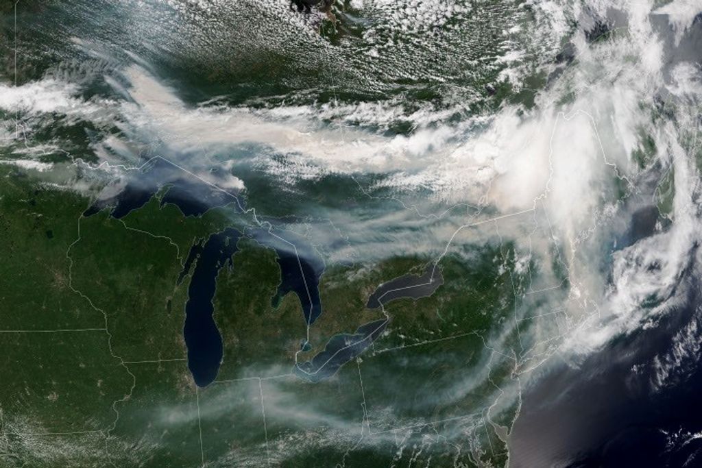
Hurricane Florence
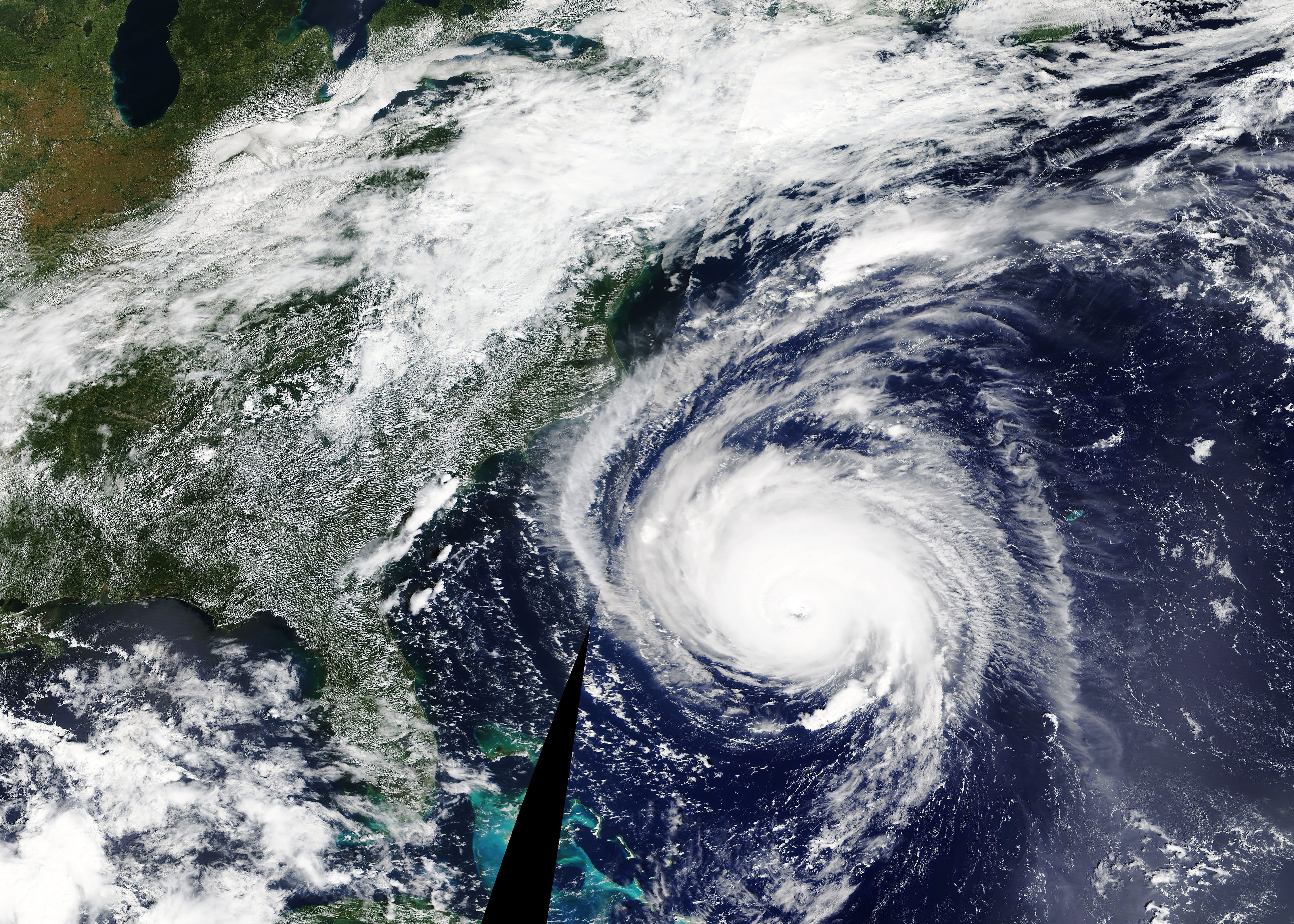
Before making landfall, Hurricane Florence churned in the Atlantic for a full two weeks — making it among the longest-lived cyclones of the 2018 season. When it finally made landfall on Sep. 14, the storm devastated the southeastern U.S. coast with intense winds, torrential rains, and severe flooding.
This natural-color image was acquired by MODIS on the Terra Satellite on Sep. 12, 2018. The center of the storm was 435 miles (700 km) southeast of Wilmington, North Carolina. Around this time, the National Hurricane Center and U.S. Air Force were reporting sustained winds of 125 miles (205 km) per hour.
At least 28 cities and towns in North Carolina received at least 20 inches (51 cm) of rain — breaking various records throughout the area and causing catastrophic flooding.
Our Disasters Program used sensors to monitor soil moisture, soil saturation, and rainfall rates. These variables helped create flood proxy maps that were shared with the Federal Emergency Management Agency (FEMA) and the National Guard to estimate how many and which communities would be most affected by the storm, in order to help prepare recovery efforts ahead of time.
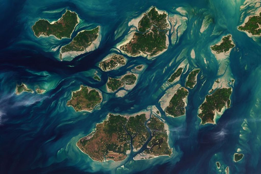
Australia’s Lake Eyre Basin
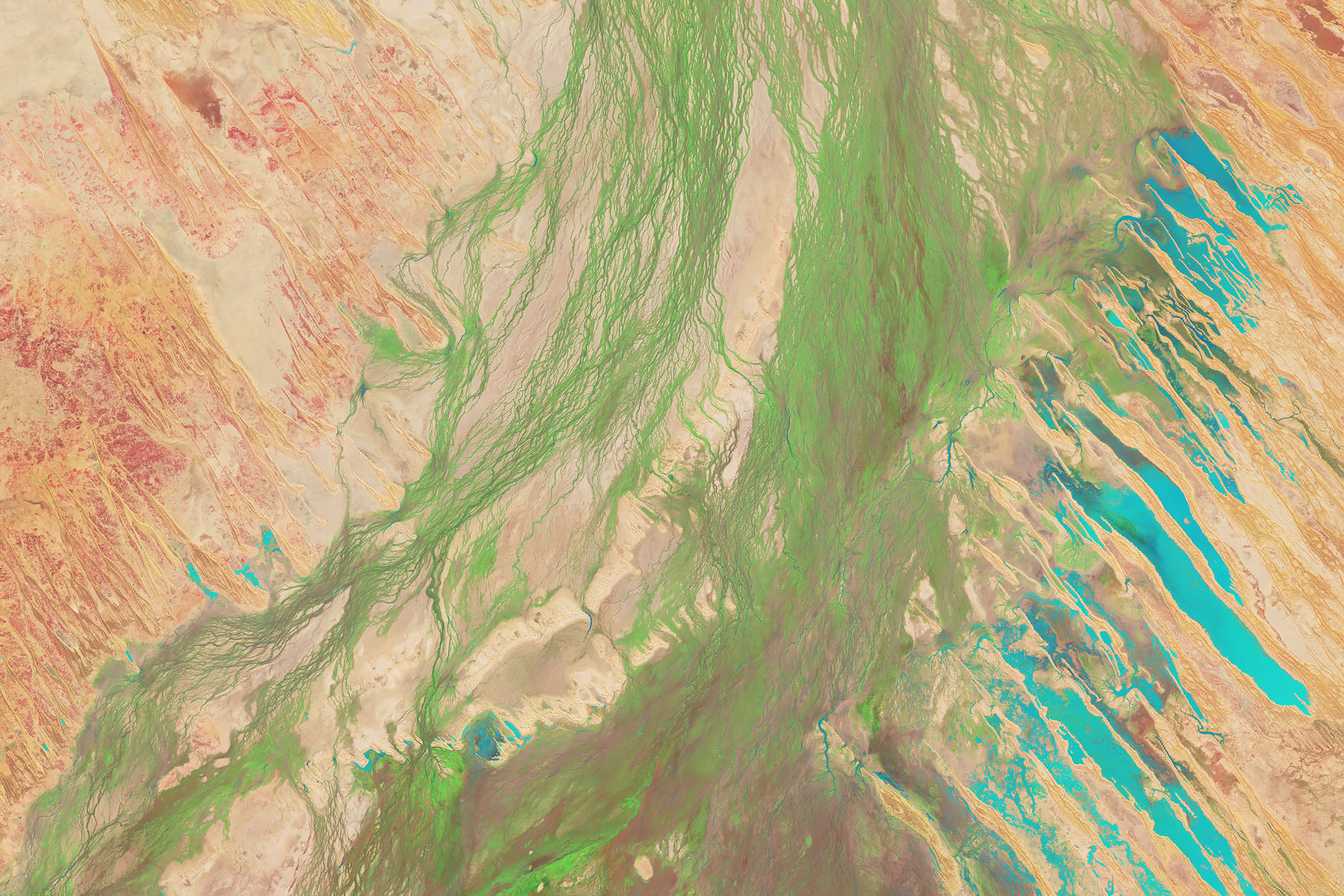
The Lake Eyre Basin covers one-sixth of Australia and is one of the world’s largest internally draining river systems. However, the rivers supported by this system are ephemeral, meaning that they only run for short periods of time following unpredictable rain — the rest of the time, the Basin is a dry, arid desert.
However, when a heavy rain comes, the basin can erupt in an explosion of green. In this false-color image captured by the Operational Land Imager (OLI) on Landsat 8 on Apr. 25, 2018, you can see how the vegetation completely envelops the spaces where the water has receded. (Flood water is indicated by light blue, and vegetation is indicated by light green.)
False color is used to emphasize the places where sedges, reeds, and grasses have germinated along the floodplain. The life cycles of these plants have become accustomed to the infrequent, unpredictable bursts of rain.
Alaska’s Chukchi Sea
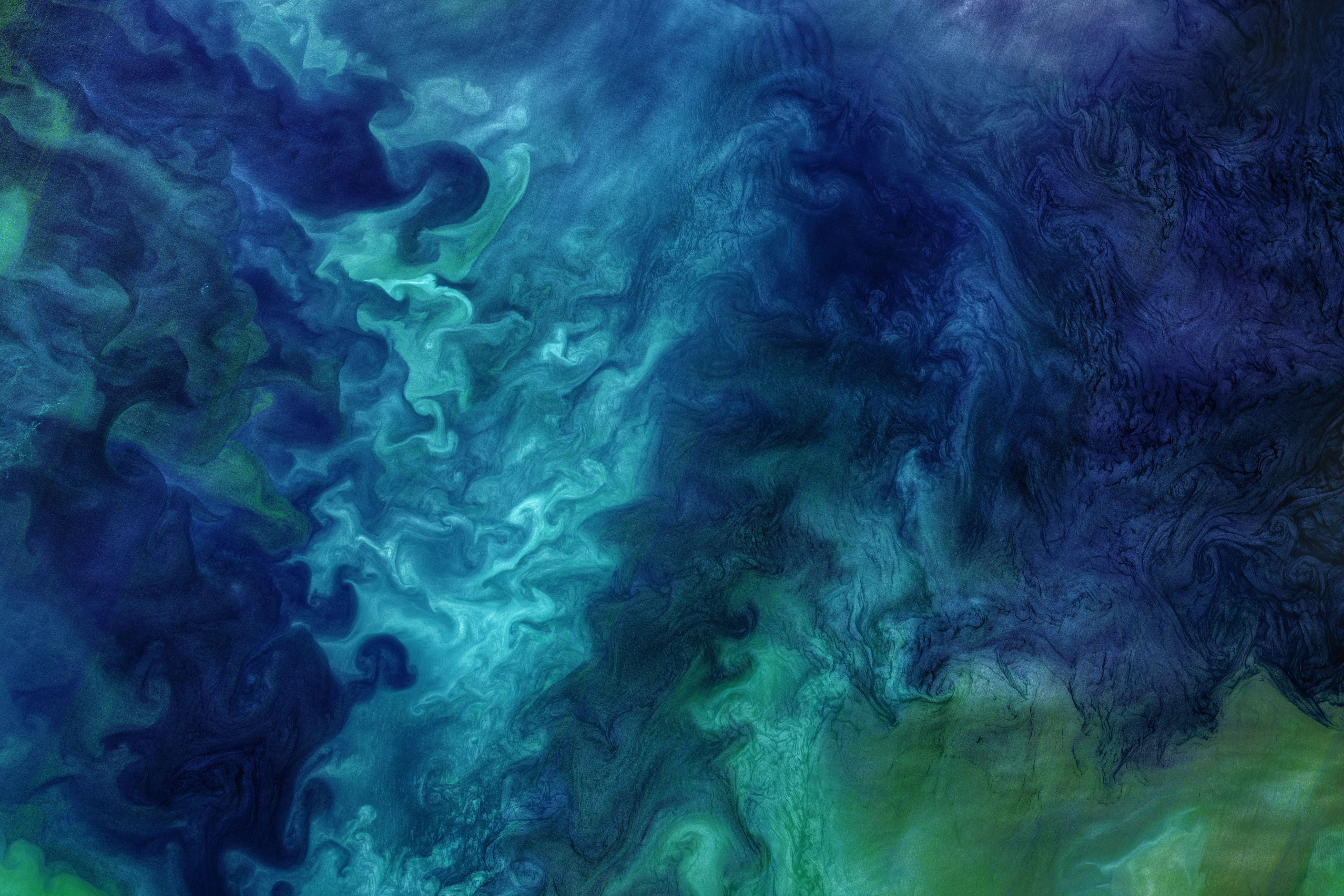
A Monet painting comes to life as the Chukchi Sea swirls with microscopic marine algae.
This image was captured off the Alaskan coast by OLI on Landsat 8 on Jun. 18, 2018. After the Arctic sea ice breaks up each spring, the nutrient-rich Bering Sea water mixes with the nutrient-poor Alaskan coastal water. Each type of water brings with it a different type of phytoplankton and the surface waters have just enough light for the algae to populate and flourish. The result is these mesmerizing patterns of turquoise and green.
This image represents one piece of much larger, incredibly complex ecosystem. While one would not normally associate the breaking up of sea ice with phytoplankton blooms, the process is an intricate part of the phytoplankton life cycle. The size of the blooms have varied greatly from year to year, and experts are unsure why. Images like this can help scientists track the development of these blooms and link it to other environmental changes.
Hawaii’s Kilauea
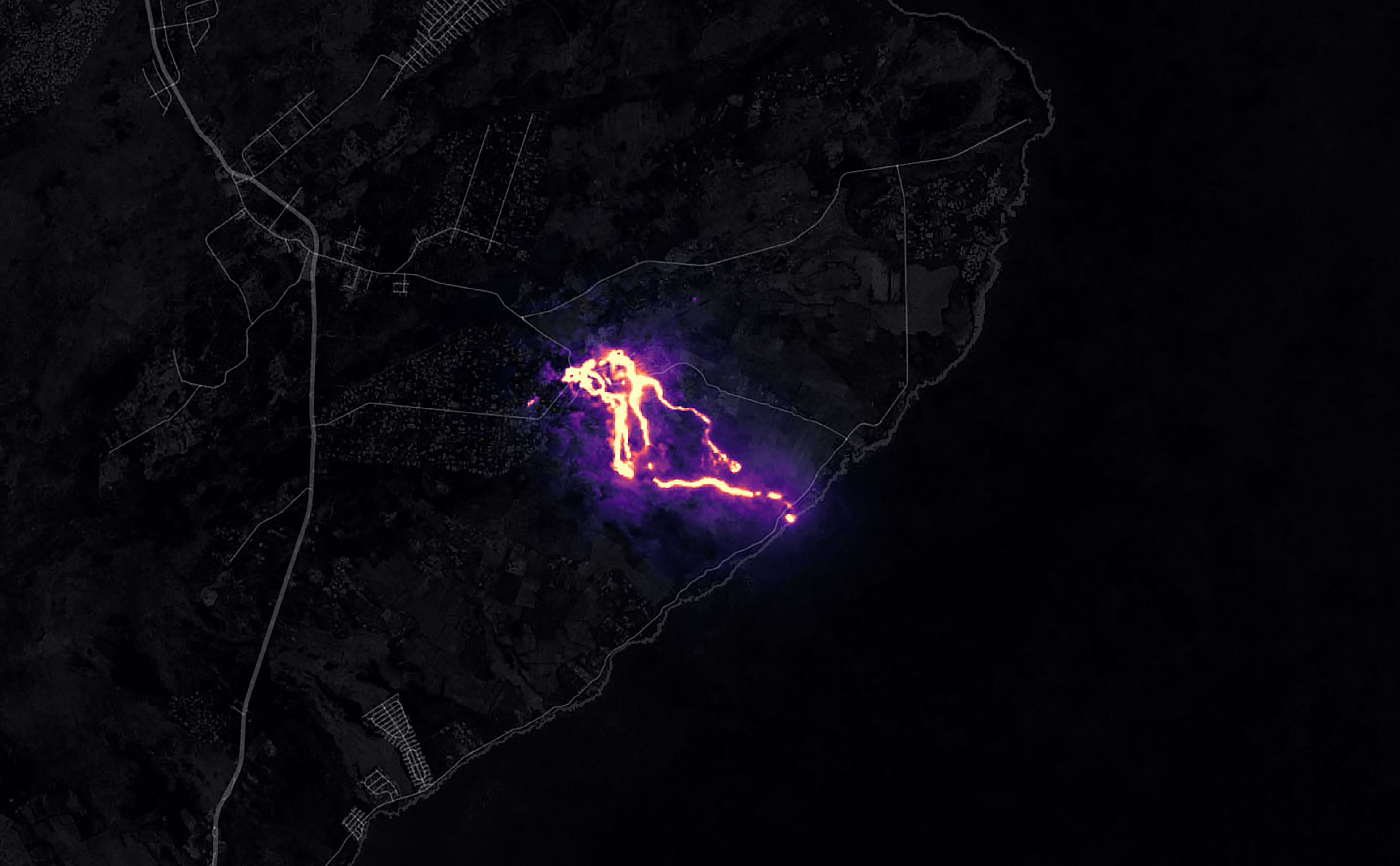
Sometimes fresh lava is best viewed in infrared.
This false-color image of Kilauea, captured by OLI on Landsat 8 on May 23, 2018, shows the infrared signal emitted by lava flowing toward the sea. The image is based on OLI’s observations of shortwave infrared and green light. The purple areas surrounding the glowing lava are clouds lit from below, indicating that this image was taken through a break in the clouds.
The Puʻu ʻŌʻō Kupaianaha eruption has been continuously spewing red-hot lava since 1983, making it the longest eruption at Kilauea in recorded history. However, new fissures opened up this year that forced many to evacuate the area.
During the last week of April, the lava lake at the Halema’uma’u Overlook crater overflowed and also flowed underground after the crater floor collapsed. The movement of the magma triggered a series of earthquakes across the East Rift Zone. New fissures opened in the residential neighborhood of Leilani Estates. One fissure produced fountains of lava that soared hundreds of feet into the air, coalescing into a river that flowed toward the sea. It evaporated Hawaii’s largest lake in hours and destroyed hundreds of homes in Vacationland and Kapoho. By the time the eruption ended, 14 square miles (35 square km) of land had been covered by lava flows.
Imagery, seismometers, and ground-based instruments were used to track the underground movement of magma. Infrared imagery can be incredibly helpful in disasters like this to view data that cannot be observed with the naked eye.
California’s Woolsey Fire Scar
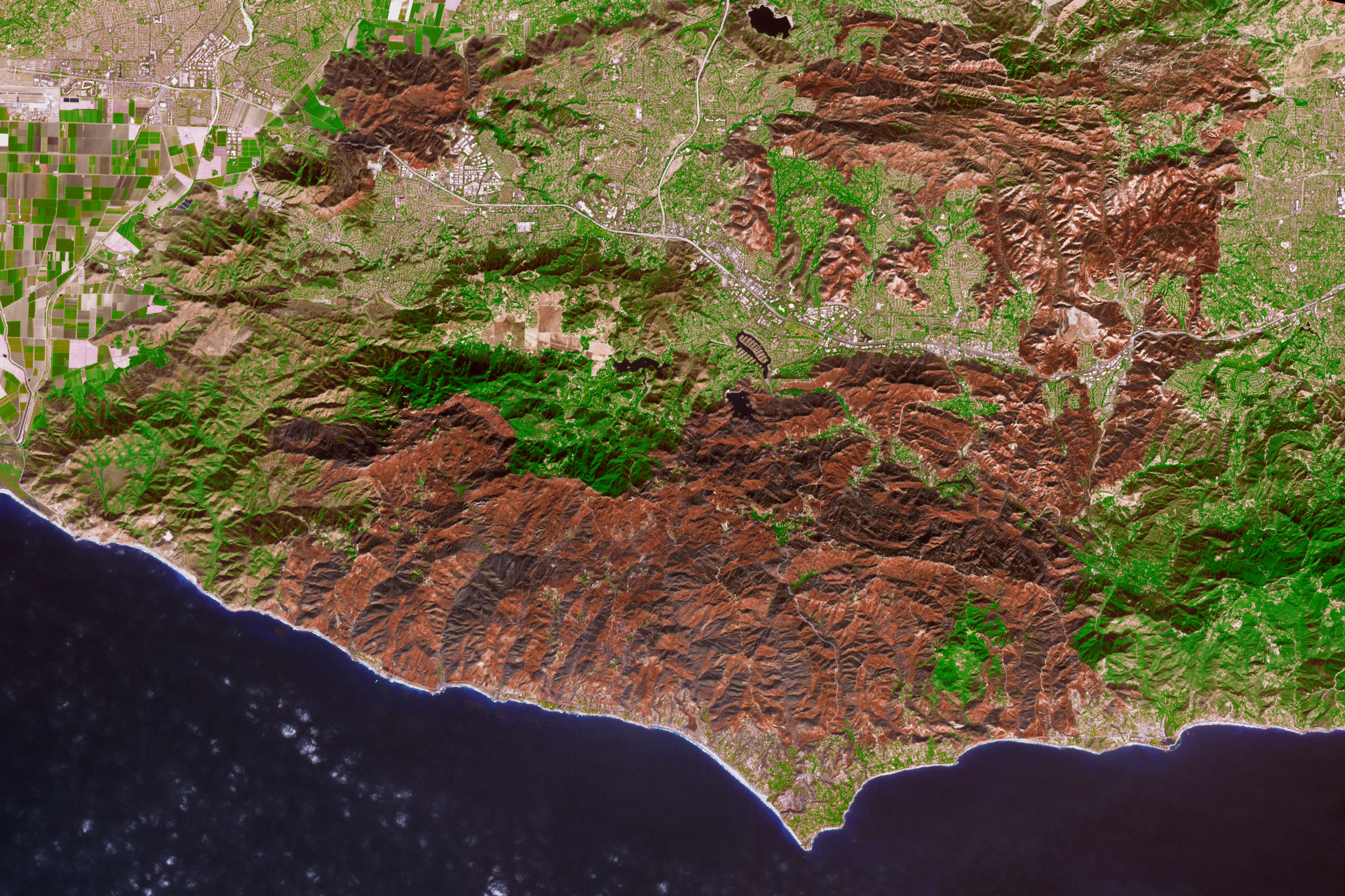
Nothing quite encapsulates the destruction of a wildfire like a photo from outer space.
This image of the Woolsey Fire aftermath in Southern California was captured on Nov. 18, 2018 by the Advanced Spaceborne Thermal Emission and Reflection Radiometer (ASTER) on the Terra satellite. This false-color infrared image has been enhanced to clearly show the burned vegetation (indicated by brown) and the vegetation that survived unscathed (indicated by green).
The Woolsey Fire clearly left its mark, with almost 152 square miles (394 square km) and 88% of the Santa Monica Mountains National Recreation Area badly burned.
Images like this one can assist fire managers in the area planning for recovery. Another helpful tool is NASA’s Rehabilitation Capability Convergence for Ecosystem Recovery (RECOVER), which is an online map that pulls together data on variables such as burn severity, land slope, vegetation, and soil type. Much of the data for RECOVER comes from the Landsat 8 satellite and the MODIS instruments on the Terra and Aqua satellites. The online map is then used by organizations such as the Bureau of Land Management, the U.S. Forest Service, and the Bureau of Indian Affairs to lead recovery efforts.
Bangladesh’s Padma River
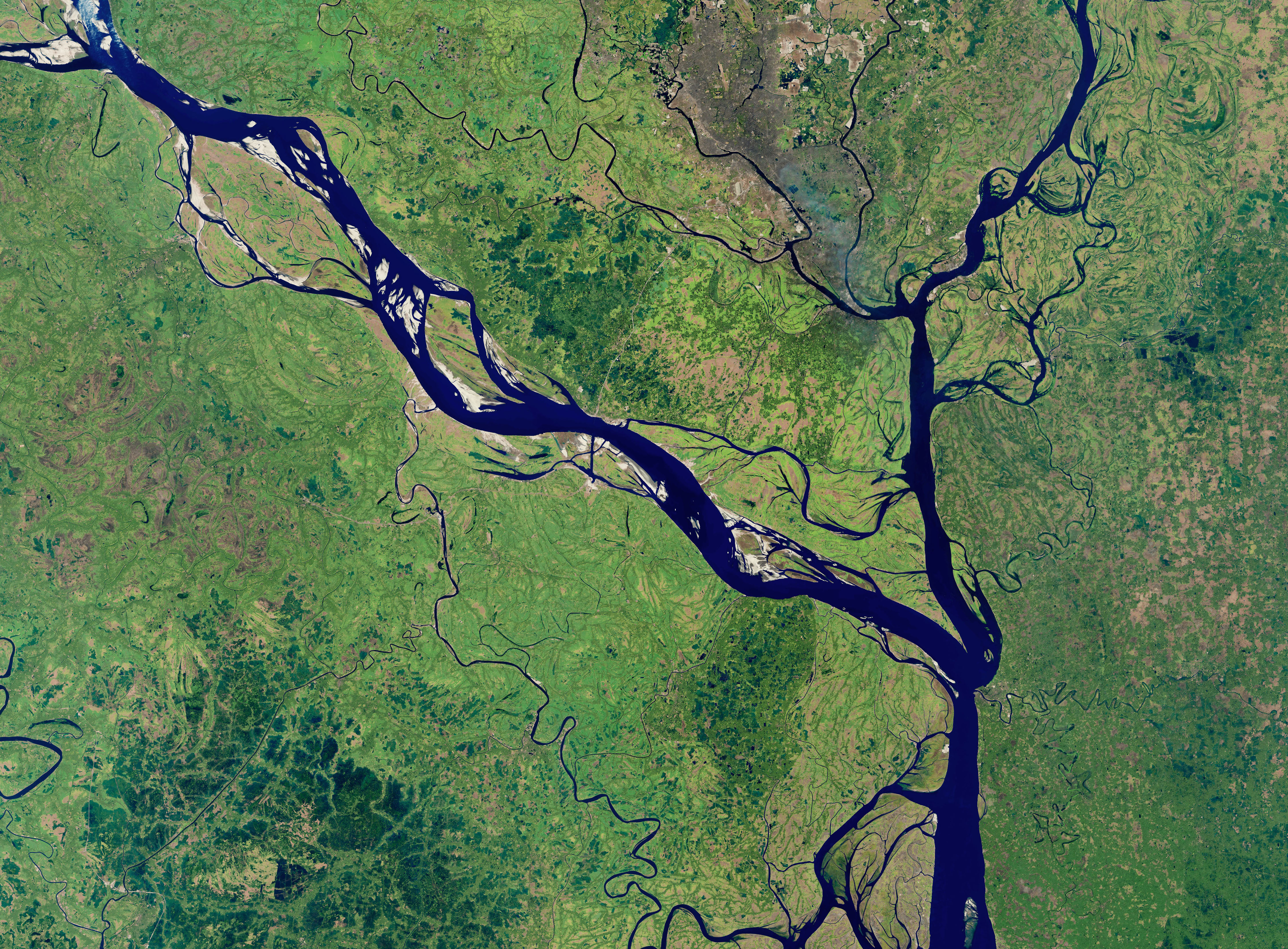
As the years go by, the Padma River grows and shrinks, twists, and turns. It never has a fixed shape, and as a result, thousands of people must regularly adapt to the constant changes in the river’s 75-mile (130 km) shoreline.
This image captured on Jan. 20, 2018, by OLI on Landsat 8 depicts one of the major rivers of Bangladesh. It begins where the Ganges and Jamuna Rivers join in India, and then merge with the Meghna River and flow to the Bay of Bengal.
For thirty years, scientists have been tracking the erosion of the river with satellite imagery. Combinations of shortwave infrared, near-infrared, and visible light are used to detect differences year-to-year in the width, depth, and shape of the river. Sometimes the river splits off but then rejoins again later. These patterns are created by the river carrying and depositing sediment, shaping the curves of the path of water.
As the riverbank erodes, chunks of land fall into the river and displace people who use the Padma for transportation or farm irrigation.
Monitoring the Padma River is going to become especially important as a new bridge development project advances in the Char Janajat area. The Padma River Bridge will connect the eastern and western parts of the country. Although the bridge will most certainly help shorten travel times for citizens, nobody is quite sure how river erosion might affect the construction and vice versa.
Alaska’s Yakutat Glacier
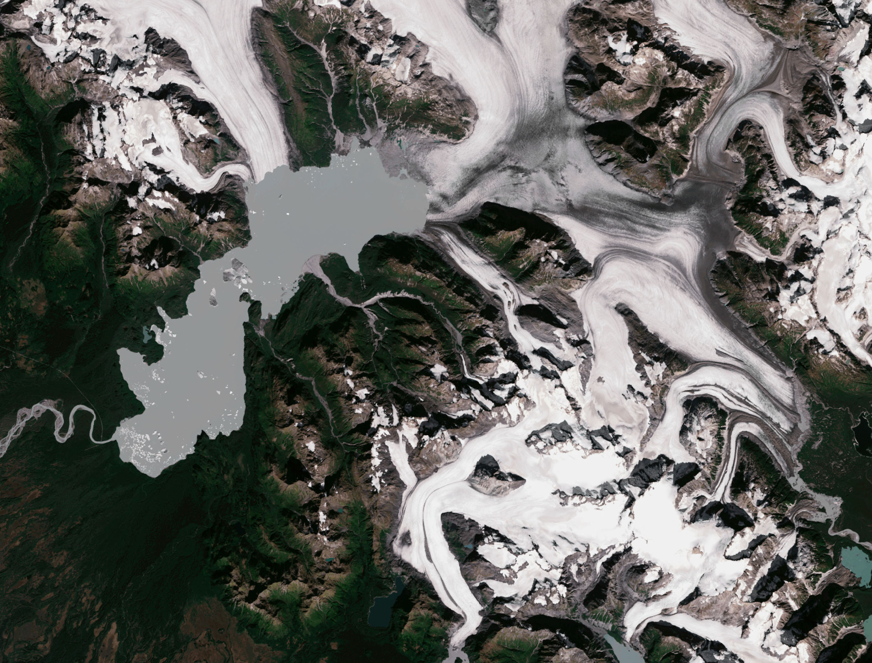
It’s hard to believe that Harlequin Lake was once all dry land — but it only started to form once Yakutat Glacier started melting. The lake appeared at the beginning of the twentieth century and has been growing rapidly ever since.
In this hauntingly beautiful image, captured on Sep. 21 2018 by OLI on Landsat 8, the effect of climate change is apparent — especially when compared to earlier images of the region.
Unless climate warming starts to reverse very soon — which scientists consider very unlikely — Yakutat could be gone as soon as 2070.
The subject matter is sobering, but notice the subtle beauty in the colors of the crisp, white ice fading into the grey meltwater and the stark contrast between the green hills and white snow. You can even see iceberg chunks floating in the middle of the lake. Images like this one are invaluable to the monitoring of environmental changes in Alaska and other places in the Arctic.
South Africa’s Theewaterskloof
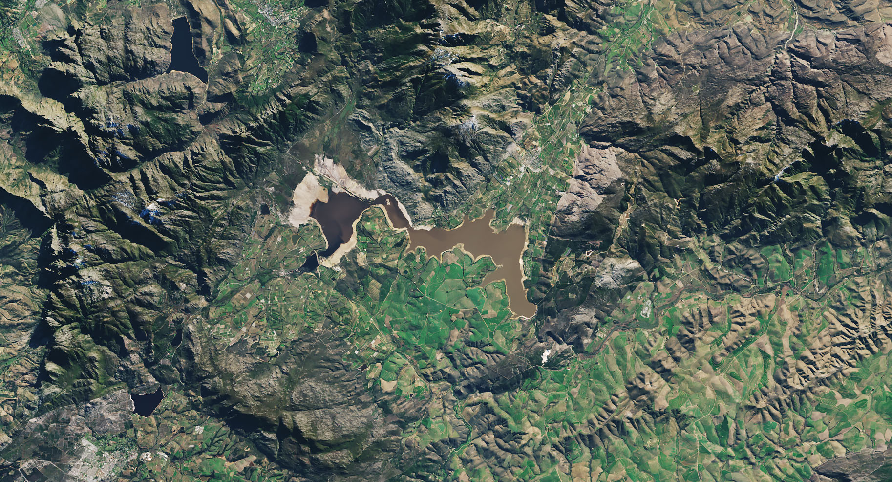
Cape Town is a seaside city planted on the tip of South Africa. It’s a city known for its beaches and biodiversity — it also almost became known as the first major city to officially run out of water.
This image of Cape Town’s largest reservoir — Theewaterskloof — was acquired on Jul. 9th, 2018 by OLI on Landsat 8. By the time this photo was taken, the city’s main reservoirs stood at 55%. This was a huge increase from where it stood just six months earlier: just 13%.
The severe water shortage in the region started in 2015, only to become more threatening after three successive and unusually dry years. The lack of rain, combined with fast population growth and a lack of new infrastructure created a recipe for disaster. The entire city was preparing for Day Zero — the day the tap water would be shut off.
Despite forecasts that Day Zero would arrive in April, a combination of heavier rains and local conservation efforts restored the majority of the reservoir. Some of these efforts included a water usage restriction, an installation of a city-wide pressure management system, and a leak repair program.
Aerosol Earth
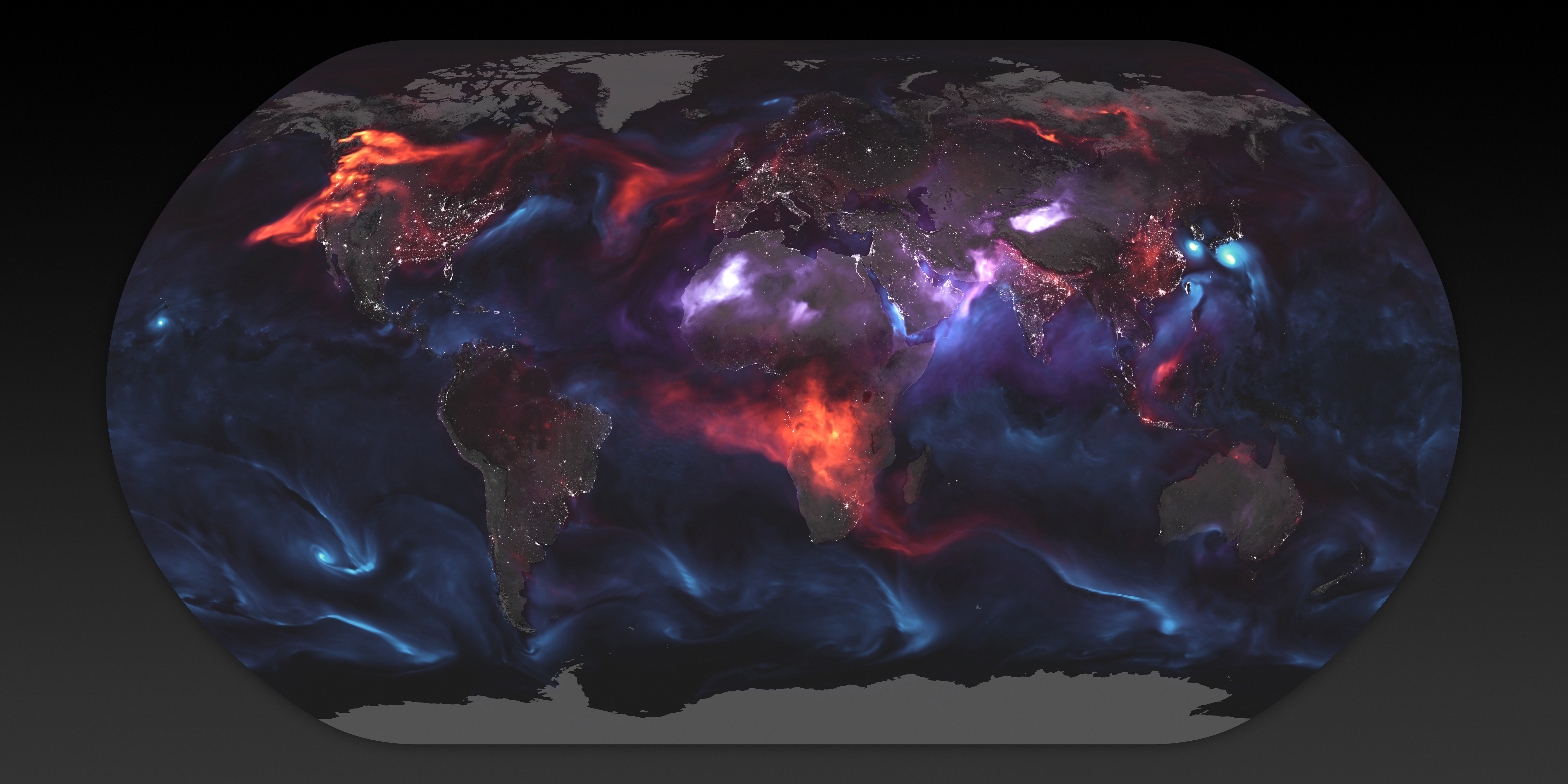
Aerosols are all around us. From the smoke from a fire to the dust in the wind to the salt in sea spray — these solid particles and liquid droplets are always swirling in our atmosphere, oftentimes unseen.
The Goddard Earth Observing System Forward Processing (GEOS FP) model uses mathematical equations to model what is happening in our atmosphere. The inputs for its equations — temperature, moisture, wind, etc. — come from our satellites and ground sensors.
This visualization was compiled on Aug. 24, 2018 — an active day for aerosols in our atmosphere. Swirls of sea salt (indicated by blue) reveal typhoons Soulik and Cimaron heading straight toward South Korea and Japan. A haze of black carbon (indicated by red) suffuse from agricultural burning in Africa and large wildfires in North America. And clouds of dust (indicated by purple) float off the Sahara desert.
This image not only reveals how much our atmosphere is affected by what happens on the ground — it also shows us how we are all affected by each other. When smoke streams from a fire or a factory, it doesn’t always stay around. If lofted high enough, upper-level winds can spread aerosols throughout the atmosphere, even as far as another continent.
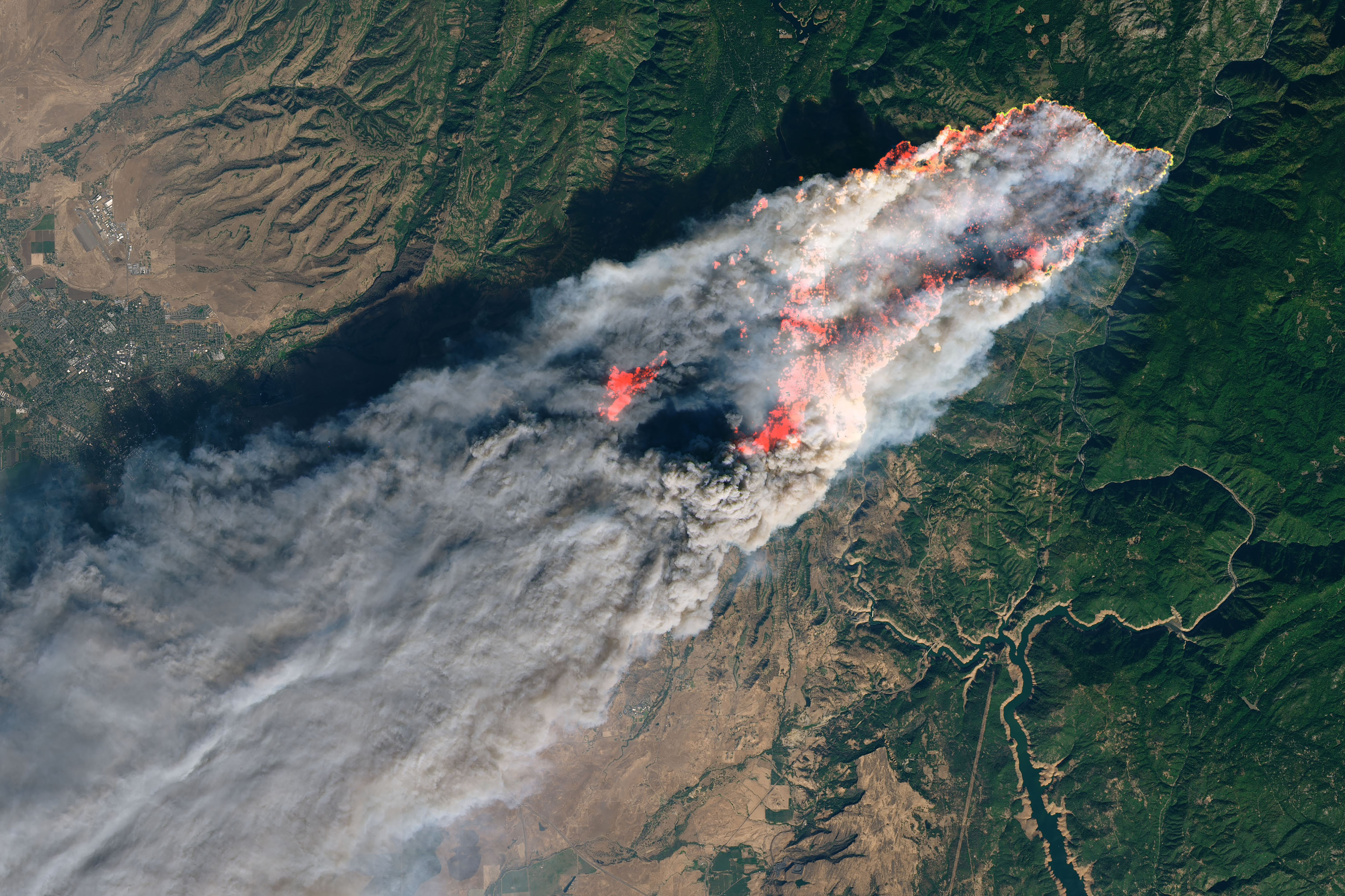
Camp Fire
With nearly a hundred fatalities, hundreds of thousands of acres burned and billions of dollars of damage, the world watched in horror as Camp Fire grew to become the most destructive California wildfire in recorded history.
This image was captured on Nov. 8, 2018, by OLI on Landsat 8 on the same day Camp Fire ignited. The images include both visible lights and shortwave-infrared light in order to highlight the active fire.
Strong winds and dry conditions fanned the flames and spread the wildfire like a rash. To make matters worse, fire resources were spread thin because the Woolsey Fire and the Hill Fire also started on the same day in Southern California.
The wildfire was not completely contained until seventeen days later, on November 25, 2018.
This image is a sobering representation of how quickly a fire can grow out of control in a short amount of time. You can almost smell the massive plumes of smoke and feel the heat of the fires.
By Thalia Patrinos
NASA Headquarters, Office of Communications