Audience
Educators
Grade Levels
Grades 9-12
Subject
Earth Science, Spanish
Type
Lesson Plans / Activities, Posters
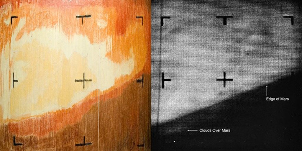
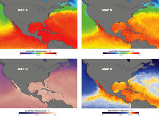
Scientists use colors and other representations for data to help interpret and visualize information. In this activity, students create their own color map and discover that selecting a good color scale is essential to understanding data and to communicating science accurately.
After completing this activity, students should be able to do the following:
- Describe why color maps are used to visualize data.
- Interpret data using a color mapped image.
- Compare and evaluate different color scales.
This lesson supports national education standards in science and geography. Downloadable student sheets and a poster are included.
This lesson is also available in Spanish.
Exploring Color Maps: Visualizing the Ozone Hole [1MB PDF file]
Explorando mapas de colores: Visualizando el agujero en la capa de ozono [1MB PDF file]
Ozone Hole Poster [2MB PDF file]

