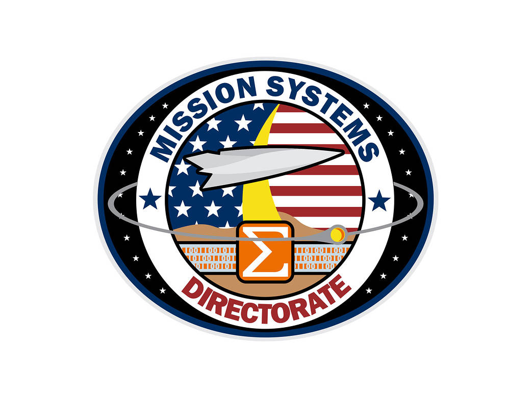
Title: Mission Operations Directorate logo
Designer: Robert Guere
Year it was designed: 2017
Explanation or story behind the patch: The large silver airframe is the ultimate representation of forward thinking flight. Dryden/Armstrong has been integral in the most cutting-edge aero technologies since the inception of the NACA and this airplane/spaceplane captures our “fly what others only imagine” Center motto. The orbiting “orb” pays homage to NASA as the focus of America’s space program, even as we are the “First A” (aeronautics). America has, in history, taken a strong interest in spaceflight.
The 1’s and 0’s represent the digital data that is the product we deliver. It’s the data we gather, process, and provide to the customer as the end product – the output of the digital data provides the knowledge and understanding piece of our motto.
The Stars and Stripes represent our nation’s dedication (through NASA) to Aeronautics and Space, and our role in that endeavor.
The yellow streak headed skyward represents our connection to NASA’s spaceflight programs, as well as speaking to the romance of flight as being “headed skyward.”
Our Latin motto “Ex Binarii Cognito” loosely translates to mean “From Binary: Knowledge and Understanding.”
The “sigma/sum” talks directly to the culmination of personnel and resources that are required to achieve our mission, while at the same time, the orange background with sigma represents the heritage of aeronautics flight test. Orange is historically used as the wire color and component color of instrumentation added to aircraft.


